P042
Private-Label Silk Artwork and Colour Guide for B2B Buyers
We help B2B buyers turn a general artwork or colour idea into a clear discussion about a named silk article. Start with the customer unit, then identify the buyer-owned asset, colour reference, visible surface, pattern direction, label or insert location and pack-visual decision that needs attention. We do not assume that a mood board, logo file or marketplace image defines a finished product. Tell us what each asset is meant to clarify so the art conversation stays connected to the silk item your business intends to offer.
Published by China EverBen Silks Reviewed by Mark Liu
Keep artwork rights, placement, color, and label controls connected
Identify the authorized asset, product surface, method, proof stage, pack, and decision owner.
Establish the Buyer-Owned Artwork Starting Point for Each Silk Article
We begin an artwork conversation by identifying the finished silk article and the buyer-owned asset your team wants to discuss. A logo, motif, illustration, product photograph, written phrase or colour board can all be useful, but none of them has one universal meaning. Tell us what the asset is for, what item it relates to and what visual question remains. This keeps a pillowcase, bedding piece, sleep mask or accessory discussion closer to the product your customer will actually see.
Name the Article Before You Attach a Logo or Motif
A silk pillowcase, mask or gift unit gives artwork a physical context
The product surface should lead the creative conversation
We ask buyers to name the finished silk article before they send a logo file, motif or mood board. A pillowcase has a different visible surface and customer role from a duvet cover, sleep mask, bonnet, scrunchie or gift pouch. The item tells your team where the artwork question belongs. If you are planning a retail range, explain whether the article is a core product, a seasonal colour addition, an accessory or a gift-led unit. If you are preparing a hospitality or corporate programme, explain the recipient setting. Then identify the buyer-owned asset and the one visual decision it is meant to inform. This approach keeps a logo from becoming a general instruction to brand every surface. It also lets product, brand and procurement colleagues talk about the same physical item. We do not assume how an asset should be used from its file name or appearance. A direct article-first brief gives the conversation an honest boundary and helps your team decide what needs further discussion.
Tell Us What Each Buyer-Owned Asset Is Intended to Clarify
A short purpose note keeps an image or file from being misread
State whether it concerns colour, motif, placement, package or customer moment
A useful artwork submission gives every shared asset a purpose. A logo may be intended for an exterior wrapper rather than the silk textile. A reference image may show a colour mood or folded presentation rather than a finished print. A motif may be under review for a visible pillowcase face but not for the reverse or pack layer. Explain the exact product question each asset informs and the issue it does not settle. This protects the product brief from ambiguity and lets a brand colleague share creative direction while purchasing keeps the inquiry tied to a named article and open point. A large unlabelled library is unnecessary at the start; the useful material is the specific visual reference that explains a product decision. Keep buyer-owned artwork within the defined brief and connect it directly to the silk article, component, or customer moment.
Keep an Early Creative Direction Separate From a Settled Product Decision
A concept can guide exploration without defining every detail of the article
Make open placement and colour choices visible to your own team
A brand or product team may be exploring several creative directions at once. You may have a logo treatment, a palette, a motif or a gift message that feels promising while the article, package layer or customer unit still needs discussion. We encourage you to state that distinction plainly. Tell us which points are buyer decisions and which ideas are still being compared. This avoids treating a mood board as though it has already determined the silk product, label or package. It also helps colleagues understand which question they need to answer. A product manager may be deciding the article and visible surface, while a brand colleague is considering the visual hierarchy. Procurement can then bring the correct open question into the B2B conversation. We will discuss the asset and product context you name rather than infer a final arrangement from an early file or image.
Build a Colour Reference Hierarchy That Starts With the Customer Unit
Colour references become more useful when buyers state which product layer they are intended to influence. A silk textile surface, contrast edge, pouch, sleeve, card and box can all play different visual roles. We ask your team to begin with the customer unit and decide what colour should be noticed first, what should support it and what belongs only to a separate presentation layer. That produces a clearer art conversation than simply sending a palette without a product map.
Identify the Main Colour Role of the Silk Article
The visible textile can lead a quiet, bold or coordinated customer experience
State the product surface your colour direction is meant to guide
Start by naming the silk article and the visible area your colour direction concerns. A pillowcase pair may be part of a calm bedding collection, a sleep mask may be a smaller accent in a beauty or travel unit, and a scrunchie set may contribute colour to an accessory story. Tell us what role the textile colour should play for the customer. Is it the central visual signal, a supporting neutral, a seasonal addition or a contrast within a gift presentation? A colour reference is more useful when it is attached to that question. We do not assume that a digital screen appearance, a general colour name or a marketplace photograph defines the final result. We discuss the buyer’s intended visual relationship within the named product unit. This helps product and brand teams separate a collection mood from the colour question for a specific silk surface.
Separate Textile Colour From Packaging and Printed Accent Colour
A sleeve or card can support the silk item without copying its colour exactly
Give each layer a visual job before you compare colour references
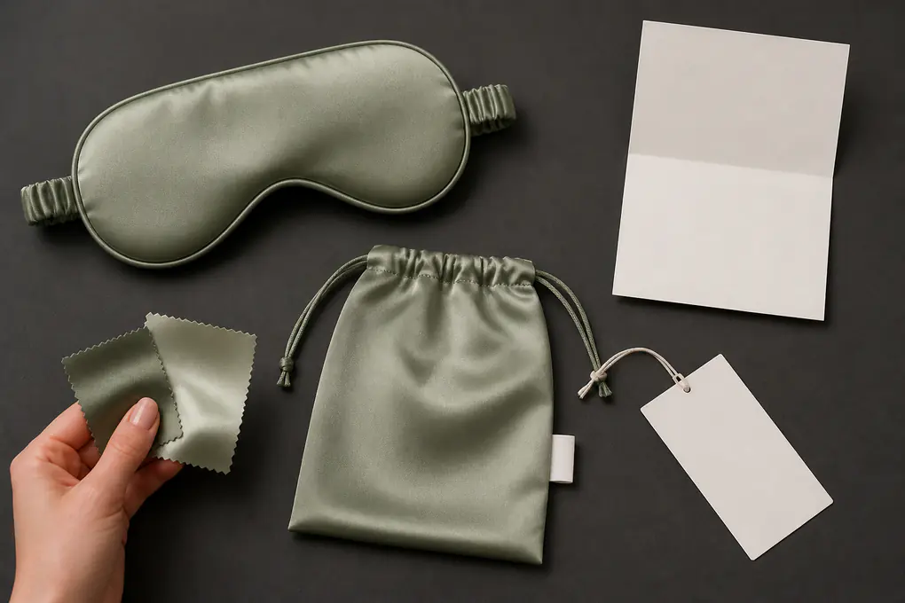
A silk article and the packaging around it do not have to carry the same colour in the same way. The textile may be the main visual focus, while a sleeve, card or box provides a quieter frame, a contrast or a collection cue. We ask buyers to name the layers and explain how they should relate. A pillowcase colour might be intended to lead, with a neutral outer sleeve. A sleep mask may sit inside a pouch with a different supporting tone. A gift card may carry an occasion message that does not need to repeat the textile colour exactly. This hierarchy gives your team more control over the customer experience. It also prevents an early palette from being repeated across every component without a reason. State what the colour reference is intended to influence and which layers remain open. We can then discuss the art direction around the actual customer unit rather than a broad colour concept disconnected from the article.
Use Colour References With a Written Product Purpose
A swatch, photograph or palette needs a short explanation
Tell us what the reference shows and what it does not decide
A buyer may share a swatch, photograph, colour board or existing product image because it helps explain a visual direction. We welcome a clear reference when it comes with a written purpose. You might say that a swatch is intended to show the main pillowcase colour family, while the edge and package colours are still being considered. You might explain that an image is useful for the relationship between a sleep mask and a gift card, not for the complete article layout. This keeps your creative material meaningful for everyone involved. We do not treat a reference as a full instruction or a substitute for the customer-unit brief. A short purpose note gives your brand, product and procurement colleagues a common way to discuss the colour question, and it gives us a better starting point for the B2B conversation about the named silk component.
Put Motifs and Repeats on the Actual Silk Surface Under Discussion
A motif or repeated pattern needs a named surface, article and visual role. We ask buyers to identify whether the design is intended for a pillowcase face, a bedding component, a sleep-mask front, an accessory exterior, a pouch or a printed package layer. That avoids a common art-brief problem: a pattern looks attractive in isolation, but nobody has stated where it belongs in the product unit or what the customer should notice first.
Name the Surface That Carries the Motif
A print question should start with the physical area your team is considering
Do not let one artwork file imply coverage across every component
When your team is considering a motif or repeat, name the silk surface before you discuss scale or colour. A pillowcase may have a main face, reverse and edge area. A bedding article may have separate visible panels. A sleep mask has a front that can be visually distinct from its reverse, binding or strap. A scrunchie has an exterior shape that behaves differently from a flat fabric panel. Tell us which area is under discussion and what role the design should play. Is it meant to lead the customer experience, act as a subtle detail or connect the article to a wider collection? This gives the pattern a product home. We do not assume that a motif should cover every surface, carry into a pouch or appear on a package merely because it is part of a buyer-owned art file. A named surface lets product and brand teams discuss the actual silk item rather than a detached pattern tile.
Describe the Repeat as a Customer-Facing Visual Decision
Scale and spacing should be discussed in relation to the article shape
A repeat can feel different on a pillowcase, mask or small accessory
The way a motif repeats can change the customer impression of a silk article. A wider pillowcase face offers a different visual field from a small sleep mask, a narrow trim or a gathered scrunchie. We ask buyers to state what they want the repeat to accomplish: a quiet texture, a visible pattern, a directional design, a gift-led message or a connection to another item in the range. Then identify the article and surface where that decision matters. This is more useful than asking a pattern image to define a product by itself. A brand team can explain the intended visual rhythm, while a product team keeps the conversation connected to the actual shape and component. We do not infer a final scale, placement or print outcome from a general motif. We discuss the buyer’s stated question around the named silk item, allowing your team to keep open choices visible until it has decided how the design should function in the customer unit.
Keep Textile Motifs Separate From Printed Pack Graphics
A design may appear on the silk, the package or both, but each choice has a different role
State where the buyer wants the customer to encounter the visual first
A motif used on a silk textile article can have a different purpose from the same visual used on a sleeve, card, pouch or box. The textile may be the main product expression, while the package may use a simplified colour cue or a limited detail. We ask buyers to state whether a design belongs on the article, the presentation layer or a specific relationship between both. This makes the customer journey easier to discuss. A recipient may first see a restrained outer box, then discover a patterned sleep mask. A shopper may see a pillowcase fold through a sleeve and only later notice a small printed detail. By separating textile motif questions from pack-graphic questions, your team can make more deliberate choices about what belongs in each layer. We do not assume that an art file applies to every component. We focus on the visual map your business is considering for the named unit.
Decide Pattern Direction Before Artwork Meets a Pillowcase, Sheet or Mask
Directional patterns can create a strong visual identity, but they need to be discussed against the way a finished silk article is seen, folded and used. We encourage buyers to state how the design should relate to the product orientation rather than assume that a digital artwork view answers the question. A pillowcase, bedding piece, sleep mask and accessory each present direction differently to a customer.
Describe the Intended Viewing Direction of the Finished Article
A customer sees a product from a particular orientation, not from a flat file view
Name the front, top, opening or other viewing point your team is considering
A directional motif needs a reference point in the finished article. For a pillowcase, your team may be considering how a pattern reads across the main face when the item is placed on a bed or displayed folded. For a bedding piece, the visible orientation can relate to the way the component is styled within a customer image. For a sleep mask, the front silhouette may be the main viewing point, while a scrunchie has a gathered shape rather than one flat orientation. We ask buyers to name the product and viewing moment that matter to them. This lets your art direction become a product discussion rather than a question about a digital canvas alone. We do not infer the finished orientation from an unlabelled file. Tell us how you expect the customer to encounter the article and which visual relationship your team wants to explore.
Connect Directional Artwork to the Fold and Display You Plan
A folded retail unit may reveal a different part of the design from an opened product
Use the customer presentation to frame the pattern question
A silk article can be viewed flat, folded, paired, placed inside a box or styled with another item. A directional pattern may therefore need to be discussed alongside the display or unboxing moment your business intends. A pillowcase fold could reveal one part of a larger motif. A sheet component may be shown with only a selected area visible. A sleep mask may lead with the front pattern while the strap and reverse are separate design questions. We ask buyers to explain which product moment is important to their team. This does not mean a photograph or packaging concept settles the art decision. It means the visual context is clear enough to ask the right question. By connecting direction to the planned fold or display, product and brand teams can see how the customer will encounter the pattern, and procurement can keep the B2B discussion attached to the relevant silk article and customer unit.
Keep Directional Variants Clear When a Range Uses More Than One Article
A pattern can be related across products without being copied without thought
State which article carries the lead direction and which uses a supporting expression
A private-label range may include a pillowcase, bedding component, sleep mask, accessory or gift presentation with related visual ideas. We encourage buyers to identify which article is intended to carry the lead directional pattern and how other items relate to it. A full motif on a pillowcase may be supported by a smaller placement on an accessory or a restrained colour cue on the pack. This helps a range feel connected without forcing a flat design approach onto products with different shapes. It also gives each SKU a clear art question. We do not assume that a direction suitable for one item should transfer unchanged to another. Tell us what is shared, what is distinct and what your team still needs to decide. That clarity is more useful than a broad instruction to place the same art everywhere.
Mark Artwork Zones Around Seams, Edges and Openings in the Finished Product
A silk article is made from finished components, not only from a flat visual surface. Seams, openings, borders, binding, elastic, labels and folds can all affect where a buyer wants a logo, motif or colour detail to appear. We ask buyers to identify the zone they are discussing and the customer role it serves. This gives art, product and procurement teams a direct way to talk about placement without making a general file carry hidden construction assumptions.
Identify the Main Visual Field Before You Discuss Small Details
The primary surface gives motifs and logos a visible hierarchy
State what should remain calm and what should draw attention
A finished silk article often has one main visual field and several supporting areas. A pillowcase may have a broad face, an opening edge and a smaller sewn label. A sleep mask may have a front panel, binding and strap. A bonnet may have a crown and a band. We ask buyers to identify which area should carry the main visual direction and which areas should remain supporting details. This prevents a general instruction to place a logo or motif from being interpreted across every seam or edge. It also gives your brand team a clearer choice about what a customer should see first. We do not assume the exact construction or placement from a general image. We discuss the product zones and visual hierarchy your business names, keeping the art conversation tied to the article and customer experience rather than a detached graphic file.
Use Edges, Borders and Openings as Deliberate Design Questions
A detail near a seam or opening should have a stated product purpose
Name the article feature that makes the placement relevant
An edge, border or opening can be a meaningful part of the customer experience when a silk article is folded, opened or styled. A pillowcase border may be visible in a retail image. A bedding edge may contribute to the look of a coordinated set. A sleep-mask binding can frame the front silhouette. We invite buyers to state whether a logo, colour change, motif or other visual detail is being considered near one of these areas and why. This gives the placement a product purpose. It also lets your team separate an edge question from a main-surface question. We do not infer how a design should cross or avoid a seam, opening or other construction feature. A clear brief names the finished article, zone and visual intention, then leaves unchosen details open for the buyer discussion.
Keep Internal Components Out of Customer-Facing Artwork Assumptions
A hidden area may need a different question from a visible textile surface
Use the customer viewpoint when deciding where visual detail belongs
A finished silk article can include components that are not the primary customer-facing visual field. These may be interior areas, support elements, hidden openings, elastic or other parts of the product. We ask buyers to decide whether artwork or colour direction is intended for a visible surface, a supporting component or an outer presentation layer. Do not assume that an art file applies to hidden areas just because it appears on a visible front in a reference image. The customer viewpoint is a helpful guide: what do they see when the item is presented, opened or used? Which component needs a brand or product message, and which should remain a quiet support element? By keeping these questions distinct, your product and brand teams can develop a more deliberate visual map without treating a general motif as an instruction for every part of the finished article.
Give Logos, Product Names, Label Copy and Inserts Separate Visual Roles
A logo, product name, label phrase, gift message and insert can all be part of a customer unit, but they do not need to sit on the same surface or carry the same job. We ask buyers to map each buyer-controlled element to the article or pack layer where it belongs. This keeps a silk textile design from being crowded by information that may work better on a card, label, sleeve or box. A named placement note also reduces the risk of carrying a mark from a presentation layer onto a textile component where it was never intended to appear.
Place the Logo Where It Supports the Customer Experience
A logo can be a first signal, a quiet detail or a separate presentation cue
Name the physical surface your brand mark is intended to occupy
When your business provides a logo, identify its proposed location and its customer role. The mark might sit on a paper sleeve, a cloth pouch, a message card, a retail tag, a presentation case, or a defined textile detail. A large mark can change the character of a calm silk pillowcase, whereas a small detail may support a gift or beauty presentation without overtaking the product. Decide what the customer should notice first: the textile item, product name, brand mark, or occasion message, then name the surface connected to the logo question. This gives the B2B exchange a clear visual boundary. An unlabelled logo file does not establish use rights, placement, size, or final treatment; we discuss the buyer-owned asset in relation to the named silk unit and current decision.
Keep Product Names and Label Wording Attached to the Correct Unit
A product identifier should describe the item a customer is receiving
Do not make one short phrase carry every message in the package
A product name or label phrase can help a shopper or recipient understand the customer unit, but it should be connected to the article or set it identifies. We encourage buyers to state whether the wording belongs on a sewn label, hangtag, sleeve, card or another named component. A pillowcase pair, sleep mask, bedding piece and gift unit may each need their own customer-facing wording. Keep the product identifier separate from a longer brand story, collection theme or occasion message. This makes it easier for customers and internal teams to understand what the unit contains. It also gives your brand and procurement colleagues a practical map for the copy they are discussing. We do not create unprovided claims, market instructions or legal interpretations. We focus on the placement, unit and customer role your business identifies for the buyer-controlled wording.
Use Cards and Inserts When a Message Needs Its Own Space
A separate printed piece can carry an occasion or brand narrative without crowding silk
Decide whether the message should be seen before, with or after the article
A card or insert can give a buyer a dedicated place for a gift note, collection message, care-related customer communication or other brand content your team chooses to provide. We ask you to describe when the recipient should encounter that message. Should it appear before opening as part of the outer presentation, sit beside the folded silk article or be discovered after the product is revealed? This sequence matters because it affects the visual hierarchy of the unit. A card should not be assumed to define the textile article, and a textile motif should not be asked to carry every written message. By separating these roles, your business can create a clearer customer experience and make a more focused packaging inquiry. We do not assume the wording or legal meaning of a buyer-controlled insert. We discuss the physical component and visual role your team names.
Create a Pack-Visual Hierarchy That Lets the Silk Article Lead
A customer unit may include a textile article, a fold, a pouch, a sleeve, a box, a card and buyer-owned visual elements. We ask buyers to decide what should lead the first impression and what should support it. A clear hierarchy can make the silk item feel intentional without relying on excessive graphics or using the same treatment for every product in a range.
Choose the First Element a Customer Should Notice
The first reveal can be the silk, a colour story, a brand mark or an occasion message
State the visual order your team wants to discuss
When a shopper or recipient encounters a silk product, one element usually leads the experience. It may be the folded textile, a visible colour, a logo on a sleeve, a gift message or the opening of a box. We ask buyers to name that first element and explain why it matters to the customer unit. A pillowcase pair may be allowed to lead through colour and fold, while a corporate-gift sleep mask may be introduced through an occasion-led card or box. A beauty accessory may need a simpler outer cue before the product is revealed. By setting the order, your team can decide where artwork belongs and what can remain quiet. We do not assume that a visual package format or graphic style applies to every silk article. We discuss the hierarchy your business is exploring for the named item and customer setting.
Use Supporting Layers to Frame Rather Than Repeat the Main Design
A pouch, sleeve or box can support the textile without copying every motif
Let each pack layer make its own contribution to the unit
A supporting pack layer can create a useful customer frame around a silk article. A sleeve can introduce the unit and leave the textile colour visible. A pouch can add a soft presentation layer around a smaller accessory. A box can create a more structured gift moment. We encourage buyers to decide what each layer contributes rather than repeat the main motif, logo or colour across all of them. A textile design may be enough on the article, while the package uses a quieter contrast or a simple identifier. Or an outer layer may carry the collection message while the silk item remains visually calm. This approach lets a range feel coordinated without looking uniform by accident. It also gives product and brand teams a clear visual map to discuss with procurement. We do not assume a final pack structure or artwork treatment. We focus on the role each layer is meant to play in the customer unit.
Keep Range Consistency Without Erasing Article-Level Differences
A collection can share a visual language while each silk product retains its own focus
Use a hierarchy to decide what repeats and what changes across SKUs
A private-label silk range may include bedding, pillowcases, sleep accessories, hair accessories or gift formats that need to feel related to one another. We ask buyers to identify the visual elements that should remain consistent, such as a colour family, logo position, card style or packaging tone, and the elements that should adapt to each article. A pillowcase face may support a larger motif than a small sleep mask. A scrunchie set may need a different presentation rhythm from a folded bedding unit. By stating what is shared and what is article-specific, your team can maintain a collection identity without forcing every item into the same visual treatment. This also helps an RFQ stay readable: each product has its own art question, while the broader range direction remains clear. We do not infer a finished collection system from an early mood board. We discuss the buyer choices that relate to the named silk units.
Keep Colour, Print and Presentation Distinct Across Product Variants
Product variants can share an article name while changing colour, motif, pack treatment or customer role. We help buyers keep these choices visible at the SKU level. A change in colour or print does not automatically create a new product story, and a shared package does not make every variant identical. State what changes, what remains constant and which visual decision your team still needs to make for the silk unit under discussion. A short variation matrix lets merchants compare the finished customer view without confusing shared artwork with an identical textile article.
Separate a Colourway From a New Customer-Unit Concept
A different palette may support the same article without changing its basic role
Tell us whether the visual change affects the product or only its expression
A buyer may be considering several colourways for one silk pillowcase, bedding component or accessory. We ask your team to distinguish a colour change from a change in the customer unit itself. A new palette may belong to the same item, same pack layer and same customer use, while a different pairing, gift card or presentation format may create a different unit question. This distinction helps product and brand teams decide which visual details should stay consistent and which should vary. It also stops an art brief from treating every colour as a separate product programme without a clear reason. We do not assume that a colour reference defines all components or customer messages. State the article, unit and visual change your team is comparing, then identify whether the open question concerns the textile, the package or the relationship between both.
Give Limited Motifs and Core Designs Different Range Roles
A special print can be part of a range without replacing the core visual system
Name the SKU and customer role that make the difference meaningful
A range may include a quieter core design and a more visible motif for a particular customer moment, season or gift direction. We invite buyers to state which role a print is intended to play. Is it a central product expression, a limited visual alternative, a gift-led accent or a package-only detail? Then connect that role to a named article and customer unit. This keeps a special artwork idea from being copied across products where it no longer supports the customer experience. It also helps procurement understand whether the B2B question concerns one SKU, several related items or an overall collection relationship. We do not assume product availability, customer demand or commercial performance from a design direction. We discuss the visual role your business is considering and the silk article it affects.
Keep Presentation Variants Tied to the Same Product Map
A pouch, sleeve or box variation should still point back to the item inside
Use the article and customer unit as the constant while visual layers change
A buyer may be comparing more than one presentation approach around the same silk article. One pillowcase pair may be considered with a sleeve, another with a gift box, or a sleep mask may be paired with different card directions for distinct customer occasions. We ask you to keep the underlying article and customer unit visible while you compare the pack variants. This allows your team to see what is actually changing: the outer visual layer, the message sequence, the colour support or the product grouping. It also prevents a package reference from becoming a substitute for the item map. We can discuss the variant your business names without assuming that one presentation confirms the final direction for every customer channel. Clear product mapping gives art, brand and procurement teams a stronger basis for comparing visual options.
Communicate Artwork Changes in Clear Buyer Language
Artwork often changes as product, brand and procurement teams compare options. We encourage buyers to communicate those changes in plain language tied to the article, surface and customer unit. A short note that explains what changed and why is more useful than a new file with no context. It helps every participant understand whether the change affects a motif, colour, placement, label, card or pack layer without treating an early visual idea as the complete product definition. Add the current revision date to every change note. A short revision reference can help the buyer identify which artwork change applies when several colourways or packaging layers are under discussion.
Name the Article and Visual Component Affected by the Change
A clear update begins with the silk item rather than a file label alone
State whether the change concerns textile, label, card or pack layer
When your team sends an updated artwork direction, begin with the finished silk article and visual component that changed. You may have adjusted a pillowcase motif, a sleep-mask front colour, a scrunchie set card, a pouch logo or an outer sleeve pattern. Name that component before you describe the adjustment. This prevents a file change from being treated as though it affects every product or pack layer in the range. It also helps your own colleagues compare the current visual direction with the earlier idea. We do not assume that an updated asset settles every placement or product question. Tell us what the change is intended to improve for the customer experience and what remains open. That gives the B2B conversation a direct focus and keeps art communication understandable for product, brand and procurement teams.
Explain What the New Visual Direction Is Meant to Accomplish
A buyer can describe the customer effect without making unprovided claims
State whether the change clarifies hierarchy, colour, motif or presentation
A visual adjustment should have a stated purpose. Your team may be increasing the prominence of the silk article, simplifying outer presentation, changing motif scale, separating a label from a card message, or bringing a colour relationship closer to a collection direction. Describe that purpose in plain language. This makes the update useful for colleagues who were not part of the first creative exchange and distinguishes an art change from a change in the product article, customer count, or commercial question. A short note might say the pillowcase surface remains the lead visual while the exterior wrapper becomes quieter, or that the eye mask is unchanged while the card message moves to an insert. Elaborate documentation is not required; the relevant detail is enough to identify the sale-unit question now being reviewed.
Keep Open Placement and Wording Questions Visible With Each Change
An updated asset can still leave a product decision for the buyer team
State what needs further discussion instead of allowing assumptions to grow
A revised motif, palette or logo treatment may answer one visual question while leaving another open. Your team may still need to decide where a product name belongs, whether a card appears before or after the silk article, how a pattern relates to an opening or which package layer carries the collection message. We encourage buyers to list those open questions alongside the change. This is more useful than presenting an updated image as though it resolves the whole customer unit. It also lets product, brand and procurement colleagues see what must be discussed next. We will focus on the named article, component and buyer question rather than infer a final layout or customer statement from an updated file. Clear buyer language keeps an evolving artwork conversation practical and respectful of the decisions that remain with your business.
Plan Customer-Unit Photography and Product Presentation Decisions
Product photography can help a buyer show the silk article, colour relationship, fold, pattern direction or package moment that the team wants to discuss. We ask buyers to treat photography as a defined visual input rather than a full product instruction. State what the image should clarify and which parts of the customer unit are outside its scope. That helps a photograph support a focused art discussion without creating hidden assumptions about every component. Use callouts where the image needs to show a single edge, motif, or folded view.
Choose the Product Moment the Image Needs to Show
An opened box, folded article or styled surface can answer different visual questions
Connect the image purpose to the buyer decision at hand
A buyer may want an image to show a folded pillowcase pair, a patterned bedding surface, a sleep mask inside a gift unit, a scrunchie set arranged together or a pouch opening. We ask your team to state which product moment is relevant and what it needs to clarify. Is the image helping you discuss colour, the first customer reveal, motif direction, product count, a card relationship or a package layer? A direct answer keeps the image useful for the B2B conversation. It also prevents a styled photograph from being treated as though it defines unseen components, label wording, construction or commercial detail. We do not assume that an image solves every visual question. We discuss the product moment your business identifies and keep the article, customer unit and open decision visible in the written brief.
Show the Article and Presentation Layers in a Deliberate Order
Photography can reveal what is outside, inside and central to the unit
Use the sequence to help your team decide where visual elements belong
A customer-unit image can show several layers: an outer sleeve or box, a card, a pouch and the silk article itself. We encourage buyers to decide the visual order they want to examine. Perhaps the package is shown closed first, then opened to reveal the folded textile. Perhaps the silk pillowcase is the first visual focus, with a card as a supporting detail. Perhaps a sleep mask leads and the pouch is only visible after opening. This sequence can help product and brand teams discuss the customer experience and decide where artwork, colour or messaging should sit. It does not determine a final package or product layout. It gives the conversation a shared visual reference. We ask buyers to state the sequence and the decision it is meant to support, keeping photography tied to the named unit rather than a general luxury image.
Keep Lifestyle Styling Separate From the Product Art Question
A setting can create mood without deciding the product surface or label placement
Use styling to support the article instead of replacing its product map
Lifestyle styling can place a silk article in a bedroom, beauty routine, travel scene or gifting context. That may help your team consider the customer mood or audience. It does not replace the product map for artwork, labels, cards or packaging. We ask buyers to separate the setting from the finished unit. Tell us what the lifestyle image is intended to communicate and which article detail remains under discussion. A bedroom image may help explain how a pillowcase should feel within a bedding collection, while the artwork placement on the textile still needs a separate question. A gift scene may show an occasion, while the card and pouch roles remain open. This distinction helps your business use photography thoughtfully without allowing styling to hide the physical components and buyer decisions that need clear art direction.
Keep Buyer-Owned Creative Decisions With the Correct Team and Component
Artwork, colour, copy and presentation can involve several buyer-side colleagues. A product team may define the article and visible surfaces. A brand team may own the visual hierarchy and buyer-controlled assets. Procurement may organise the supplier question. We ask buyers to state which component and decision each team is considering so an artwork conversation does not become a broad request with no product boundary. Name one buyer-side coordinator for the active revision. A short owner note beside each creative question helps keep review duties from being lost when the brief changes.
Give Product Teams the Article, Surface and Customer-Unit Questions
The finished silk item gives every art decision a product anchor
State which article and component the buyer is considering
A product colleague may be deciding whether the artwork question concerns a pillowcase face, a bedding piece, a sleep-mask front, an accessory exterior, a pouch or another named component. We ask buyers to make that product boundary clear before the visual direction is discussed. This helps a brand team understand where an asset may belong and helps procurement keep the B2B inquiry attached to the actual item. It also prevents a broad creative idea from being applied to a product unit that has not been defined. We do not assign roles inside your organisation. We simply invite you to name the article, customer unit and open product question so the conversation can begin with the physical silk item. A clear product anchor lets every other creative decision remain connected to the customer experience your business is exploring.
Give Brand Teams the Asset, Colour and Customer-Message Questions
Buyer-owned artwork should have a named visual purpose
Map the asset to the textile, label, card or pack layer your team is discussing
A brand team may be working with a logo, colour reference, motif, collection phrase, card message or package concept. We ask buyers to state which of these elements are under discussion and which component they are intended to influence. A logo may belong on an outer sleeve, a motif on the silk article, a product name on a label and an occasion message on a card. By mapping the assets, you keep the creative direction readable for colleagues with different responsibilities. It also keeps buyer-owned language and imagery within the scope your business intends. We do not assume use rights, final wording, product claims or a complete visual system from an early file. We focus on the asset, product component and customer role your team names, allowing brand decisions to remain with the buyer while the B2B conversation stays practical.
Give Procurement a Specific Artwork Question to Bring Forward
A concise supplier question is easier to understand than a folder of unlabelled assets
Name the article, component, visual input and open choice in one message
Procurement can help a creative discussion move forward by collecting the essential buyer inputs into a short product-specific question. Begin with the silk article and customer unit. Then name the visual component, buyer-owned asset, colour or motif reference and the choice that remains open. For example, your team may be deciding whether a pillowcase motif should stay on the main face while the sleeve carries only a colour cue. Or you may be comparing a sleep-mask logo placement with an insert-led message. A concise question lets China EverBen Silks understand the B2B discussion without guessing which file applies to which item. It also lets product and brand colleagues see that their input has been connected to the correct component. We do not need a complete creative package to begin; we need the one decision that your team wants to discuss around the named silk unit.
Prepare a B2B Silk RFQ With Complete Artwork and Colour Inputs
A focused artwork RFQ gives China EverBen Silks and your own buyer team a clear place to begin. We do not need a large unstructured collection of files. We need the finished article, customer unit, buyer-owned asset, colour or motif question, named surface or pack layer, visual purpose and the next decision your team wants to make. That information keeps the inquiry tied to the product rather than a general creative idea. Send the relevant asset once, identify its intended use, and state the buyer decision that needs input before a second creative route is explored. Reference names or dates can be included when they help the buyer distinguish two artwork directions for the same article.
Open With the Silk Article and Customer Unit
The product comes before the artwork file in a useful B2B inquiry
Tell us what your customer or recipient will receive
Open the RFQ by identifying the silk article and sale unit. The buyer might be reviewing a pillowcase, an individual bedding article, a travel eye cover, a hair-focused item, a gathered accessory set, a pouch-supported gifting piece, or another defined product. Then state the retail, hospitality, beauty, gifting, or other business context surrounding the artwork point. This makes it clear which product surface, pack layer, or customer moment the visual direction concerns. A fully developed range is not required at this stage. A direct description of the article and buyer objective establishes an efficient starting point and allows product, brand, and purchasing colleagues to confirm that the artwork question belongs to the correct item before further assets or wording are shared.
Name the Buyer-Owned Asset and the Surface or Pack Layer It Concerns
A logo, motif, colour reference or phrase needs a physical destination
Explain what the asset is meant to clarify for the customer unit
After you identify the article, name the buyer-owned asset your team wants to discuss. It may be a logo, motif, illustration, colour board, product image, card phrase or package concept. State which textile surface, label, card, pouch, sleeve, box or other layer it is intended to affect. Then explain the visual purpose. Are you deciding the main customer focus, a supporting colour relationship, a pattern direction, a logo location or an insert sequence? This information is more useful than sending an asset with no product context. It lets us understand the buyer question while your organisation retains control of its artwork and customer language. We do not infer a final layout, asset use, colour result or product claim from the file alone. We discuss the named component and open visual decision your business brings forward.
State What Has Changed and What Remains Open for the Buyer Team
Clear plain-language context prevents art discussions from losing the product decision
Keep the next question visible instead of asking a visual reference to answer everything
If your team is updating an earlier direction, say what changed and why it matters to the customer unit. You may have changed the pillowcase motif, simplified the sleeve, moved a message to an insert, adjusted a colour relationship or separated a gift-presentation concept from the textile article. Then state the question that remains open. This lets product, brand and procurement colleagues understand the current art direction without treating a new file as a complete product brief. We encourage buyers to use plain language and keep the message focused on the named silk item. A strong RFQ does not need to resolve every creative choice; it needs to identify the article, surface, buyer-owned asset and decision that needs the next B2B discussion. That clarity is more valuable than an overloaded folder or a broad request for an unspecified artwork outcome.
Private-label silk artwork and colour questions
What should a buyer include with a silk artwork question?
Name the article, customer unit, visible surface or pack layer, buyer-owned asset, colour reference, intended visual role and the open decision your team needs to make.
Can a product image define a finished print or label layout?
No. An image can show a visual direction, but placement, seams, components, wording and customer-unit context need to be discussed in writing for the specific article.
Should label and insert copy be treated as artwork?
They are buyer-controlled printed components with their own location and customer role. Keep them separate from the textile motif or logo placement in your brief.