P025
Silk Beauty and Wellness Collection Planning for B2B Brand Buyers
We work with business buying teams that are defining silk pillowcases, sleep masks, bonnets, scrunchies, and complementary gift articles for beauty- or wellness-adjacent ranges. Begin with the actual item, the customer occasion, the current visual direction, the construction or pack choice that remains open, and the buyer who owns the next decision. We keep customer-facing product language, visual direction, and commercial questions separate so a compelling range idea is not mistaken for a medical, cosmetic, hair, skin, comfort, or performance claim.
Published by China EverBen Silks Reviewed by Mark Liu
Keep beauty assortment decisions tied to each silk article
State the product family, use context, component controls, branding, pack, and buyer question.
Choose an Anchor Silk Article for the Collection
A coherent collection needs one article that explains why the range exists. It may begin with a paired pillowcase, an eye-mask concept, an adjustable bonnet, a gathered accessory group, or a gift-led combination. The buyer should select that anchor before adding companion pieces. The anchor gives brand, product, and procurement teams a common point of reference for colour, visual mood, range hierarchy, presentation, and customer occasion. It is not a promise of any customer benefit. It is simply the item that makes the collection intelligible. Once the anchor is clear, each additional silk article can be assessed for its own role rather than being added because it happens to match a photograph. In a contemporary sleep and self-care assortment, the anchor also guides the shopper's first route into the range. A pillowcase pair may establish a bed-focused ritual, whereas an eye mask can make a compact gift or travel story easier to understand. Set out the primary audience moment, the main image the brand expects to use, and the companion article that reinforces rather than distracts from that story. This lets the buying team decide whether a new bonnet, pouch, or accessory belongs because it solves a genuine assortment role, not merely because its colour can be matched.
Name the article that carries the primary customer proposition
The anchor should be recognizable as a finished sellable unit
A pillowcase, mask, bonnet, or accessory set can lead for different reasons
We invite the buyer to name the article the customer is most likely to recognize first. A pillowcase pair may lead a sleep-focused range; a mask may lead a travel or gifting idea; a bonnet may lead a beauty-adjacent edit; a scrunchie group may lead a smaller colour story. State the intended selling unit, visual role, and the customer occasion it supports. That gives the collection a product identity without describing an unverified outcome. It helps the buyer determine which details must remain consistent across the range and which may change. A defined anchor prevents a selection of silk goods from becoming a loose moodboard with no commercial hierarchy for the product, packaging, or procurement teams to evaluate.
Separate companion articles from the hero product
Related items should have a stated reason to sit beside the anchor
Each companion unit needs its own customer role and construction brief
A companion article should do more than repeat the same fabric and colour. A mask may complement a pillowcase through a gift moment; a scrunchie may extend a colour story; a bonnet may create a separate accessory choice; a pouch or card may support presentation. We ask buyers to state that relationship explicitly. Then each item can retain its own questions about shape, closure, elastic, tie, print placement, pack, or label. This is especially important for brand teams that need an assortment to feel coordinated without presenting every unit as the same product. Product and procurement colleagues can compare the individual articles while brand colleagues can see whether the collection still tells one clear customer-facing story.
Define what the customer is meant to understand first
The opening product message should arise from the article and selling unit
A range statement can be compelling without promising a personal result
We ask a buyer to describe the first thing a customer should understand: a silk sleep accessory, a coordinated gift offer, a colour-led hair accessory assortment, or a home-textile update. That customer understanding should be connected to the article, not to claims about hair, skin, sleep, comfort, wellness, or performance. A clear category and presentation message gives the buyer a useful standard for reviewing product images, product names, and packs. It also helps keep buyer-owned market wording under the right control. When the customer message is tied to a real unit and a real occasion, the range can be developed with more discipline and less risk of empty or unsupported language.
Describe the Customer Occasion Without Promising a Benefit
Beauty- and wellness-adjacent brands often organize a range around a customer occasion: a bedtime routine, a travel kit, a gifting moment, a hair-accessory edit, or a considered home presentation. These occasions help a buyer decide which silk article belongs in the range and how it should be shown. They must not be rewritten as a promise that the product improves skin, hair, sleep, comfort, wellbeing, or any personal condition. We encourage brands to use the occasion as a merchandising and product-design context. It keeps the range human and specific while leaving customer outcomes, cosmetic language, and market-facing claims inside the buyer's own responsible review. Distinguish the moment of purchase from the language used about the product. A buyer may want a silk accessory displayed beside a candle, skincare item, or travel bag as a visual cue, yet that merchandising picture should not turn into a claim about the silk item itself. Explain whether the collection is intended for a personal treat, a bridal gift, a seasonal promotion, or a coordinated bedtime edit. The product team can then shape article and presentation choices around a real customer situation while brand and legal owners retain control of any benefit-oriented wording.
Use an occasion to select the right product format
Bedside, travel, gift, and accessory moments create different article priorities
The buyer should explain the context that makes the product relevant
A bedside moment may lead a buyer toward a pillowcase pair or a coordinated mask. A travel idea may centre on a compact mask and pouch. A gifting occasion may need a set hierarchy, a card, and an opening experience. A hair-accessory edit may call for several scrunchie colours or a bonnet with a defined presentation. We ask what the customer is expected to receive and how the item will be encountered. That gives the product team a reason to consider form, colour, pack, and companion articles. It does not mean the product should promise a personal benefit. The distinction allows a brand to build a vivid collection story that remains grounded in the actual silk product and customer-facing unit.
Link the occasion to a visual and merchandising decision
A use moment can guide photography, colour, and presentation without making a claim
The buyer can specify what should appear refined, portable, giftable, or coordinated
The buyer may want the product to look refined on a bed, compact in a travel set, deliberate in a gift box, or colour-coordinated in an accessory assortment. These are useful merchandising targets. We suggest connecting each one to an article feature: a pillowcase front panel, a mask shape, a bonnet tie, a scrunchie grouping, or a pack fold. This creates a practical brief for product and brand teams. It also prevents general wellness language from replacing real product decisions. A customer occasion should tell the team what to review visually and commercially, not be used as a shortcut to imply that the item changes a customer's health, appearance, sleep, or comfort.
Keep customer-facing copy with the buyer's responsible owner
Product category language and outcome language require different review paths
Brand, legal, quality, and customer teams should own their own statements
We encourage buyers to identify any wording they want to use in a product listing, pack, campaign, or customer presentation and to keep that wording within their own approval route. We can discuss the article, its visible construction, its colour, its selling unit, and the occasion it is intended to serve. We do not supply public therapeutic, cosmetic, skin, hair, safety, comfort, or performance claims. This boundary protects the buyer from assuming that a material name authorizes a customer statement. It also lets a product conversation move forward: the brand can define the desired tone and presentation while the appropriate internal reviewers decide what language can be used in market-facing materials.
Define the Silk Surface, Colour, and Print Direction
Silk creates a strong visual response through surface, light, fluidity, colour, and print. For a brand buyer, those qualities become useful only when they are linked to a named article and customer-facing purpose. We ask whether the colour is a range direction, a print ground, a gift cue, an accessory grouping, or an item-specific choice. We also ask what the reference is intended to show: sheen, drape, motif scale, panel placement, or the relationship among products. This helps a team develop a coherent visual language without treating a photograph, a swatch, or a general silk description as a confirmed material, finish, composition, or performance specification. A collection benefits when the buyer separates colour roles instead of asking every piece to carry the same visual weight. One shade may act as a neutral foundation for bedding; a richer tone may give an eye mask or scrunchie a gift-led focal point; a print can create a limited seasonal expression. Identify which relationship must be seen in an online hero image, on a retail shelf, or after the customer opens a set. This allows a review of contrast, scale, and visual continuity without turning screen appearance or an inspirational image into a confirmed colour standard.
Set the visible surface objective for each article
Lustre, fluidity, smoothness, and print appearance are separate visual questions
A buyer can define customer impression without asserting a technical outcome
A pillowcase buyer may be looking for a smooth, light-catching face in product imagery. A mask buyer may be considering how the item reads against a gift card. A bonnet or scrunchie buyer may want a gathered silk surface that sits within a particular visual mood. These are concrete design questions. We ask the team to describe the customer impression and the article it belongs to, then keep material composition, finish, and performance as project-specific topics. This gives a creative director and procurement manager a shared language: one can explain the visual target while the other can identify what information is still needed. The collection becomes clearer without making broad claims about what a silk surface will do for the person who buys it.
Map colour families and prints to real product panels
Artwork should be judged on the finished article rather than a flat file alone
Placement, scale, gathering, openings, and folds can change the visual result
A colour or print direction should be connected to the product panel or feature the customer will see. A pillowcase motif may need a clear front-panel zone. A mask artwork may need consideration around its edge and strap. A bonnet border may relate to a tie route. A scrunchie print may appear differently once gathered. We ask buyers to identify these physical relationships before treating an artwork file as a full product instruction. This supports a more realistic brand review and helps product teams see what must be considered during the next stage. It does not claim a printing outcome or a finished product result; it simply gives the buying team a product-specific way to discuss the current visual direction.
Use colour grouping to distinguish products without fragmenting the range
A collection can share a palette while allowing each item its own identity
The buyer should state where consistency matters and where variation creates customer choice
A brand may use a shared palette across a pillowcase, mask, bonnet, and scrunchie while giving each article a distinct role. We ask which colours are meant to recur, which should remain item-specific, and how the customer will understand the grouping in a pair, set, or multipack. This informs photography, product naming, pack design, and merchandising. It also gives procurement a clearer view of the article variants being considered. A palette is not a substitute for product definition, but it can be a valuable organizing device when the buyer links it to actual selling units and customer choices. That approach creates a more coherent collection without making unsupported statements about colour performance or market response.
Resolve Closure, Edge, Lining, Elastic, Tie, and Component Scope
The customer sees a silk product as a finished article, not as a material name alone. A pillowcase opening, edge, or label position can change the front view and handling. A mask can raise a question about panels, edge, and strap. A bonnet can involve panels, lining relationship, tie route, and label. A scrunchie can involve a gathered outer body, internal elastic, seam, and set count. We help buyers list the components that shape the article they want to offer and separate the points they are ready to discuss from those that remain open. This prevents an attractive surface reference from hiding a decision about the feature that determines the actual product experience. Consider the transition from one component to the next in the exact product the shopper handles. A pillowcase face can lead the eye toward an opening; a bonnet's crown and tie create a different visual path; a gift mask may introduce a pouch or card before the customer reaches the article. Explain whether the proposed edge is expected to blend into the surface, frame it, or create a deliberate point of contrast. The buyer can then request a focused discussion around one visible construction relationship instead of leaving the team to infer a finished product from a fabric image alone.
Define pillowcase and mask construction through visible customer moments
Openings, edges, straps, and labels should be named in the brief
A construction reference is useful when the buyer explains why that feature matters
A pillowcase may be discussed through its envelope opening, zipper concept, edge treatment, visible front, or label location. A sleep mask may be discussed through its panel shape, edge, strap route, or presentation. Ask the buyer to identify the feature at issue and the customer-facing reason: a cleaner front view, easier range coordination, a different pack fold, or a particular visual hierarchy. This keeps construction comments connected to a real product decision. It also avoids assuming that a photograph settles every unseen detail. Product, design, and procurement teams can then review the same named feature and keep material, customer copy, commercial terms, and other unreviewed questions separate.
Describe bonnets and scrunchies through their article-specific components
Ties, panel layout, gathered fabric, elastic, and seams require their own context
An accessory concept should not inherit the language of bedding or pillowcases
For a bonnet, the buyer can identify the visible silhouette, panel relationship, tie direction, lining question, colour or print, and selling-unit concept. For a scrunchie, the buyer can identify the gathered body, visible fullness, elastic idea, seam, and whether it is a single item or a group. These details help a team understand the product it is trying to build. They should not be converted into a claim about universal fit, hair outcome, comfort, durability, or performance. By keeping the component scope clear, brand teams can preserve the accessory idea while product and procurement teams can identify what needs a project-specific answer. The collection can then add small articles with genuine purpose rather than generic add-ons.
Mark components that are fixed, preferred, or still open
Priority language prevents an early concept from becoming an accidental specification
The buyer can preserve creative flexibility while making a commercial brief more comparable
A buyer may have a fixed brand colour, a preferred closure appearance, an open lining question, or a packaging component that depends on another approval. We encourage simple labels such as required, preferred, open, or awaiting a buyer decision. This keeps every team aligned on the current choice. A product manager can see what needs technical discussion; a brand colleague can see where the visual direction is protected; procurement can see which details prevent a meaningful comparison. The purpose is not to over-engineer an early collection. It is to make the product direction readable, so a change in a tie, edge, elastic, or label does not disappear inside a broad phrase such as ‘silk beauty accessory.’
Build a Selling-Unit Hierarchy for Sets, Gifts, and Add-Ons
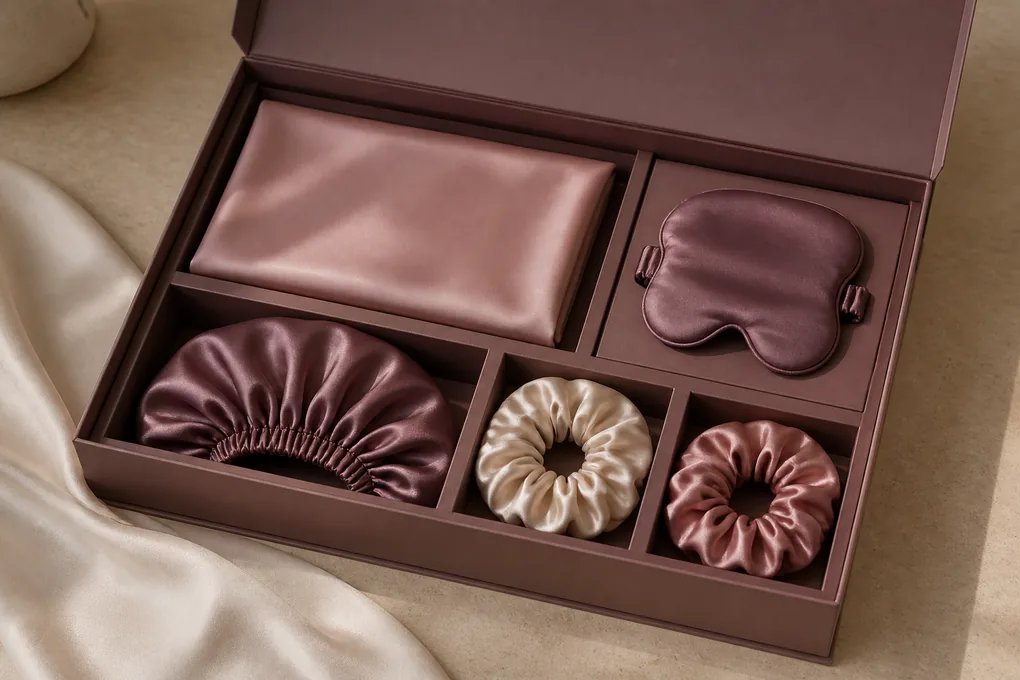
Beauty- and wellness-adjacent silk ranges often combine items, but a set should be more than a pile of compatible colours. We ask the buyer to describe the customer-facing unit first: a pillowcase pair, a mask with a card, a bonnet, a scrunchie multipack, a travel grouping, or a gift combination. Then we identify any companion pieces and their role. That framing gives brand, product, and procurement colleagues a clear picture of the offer the customer is meant to select. It also keeps retail presentation separate from unconfirmed outer handling or shipment arrangements. A well-defined selling unit supports range architecture without introducing retail pricing or promises about availability. Make the hierarchy visible in both the buying brief and customer-facing merchandising. Identify the hero article, the companion article, the optional add-on, and any item that only belongs in a specific gift or seasonal edit. A coordinated pillowcase and mask may be understood as a sleep-themed pair, while a bonnet and scrunchie grouping may need an entirely separate audience and display story. This prevents counting, card layout, and product naming from becoming afterthoughts. It also helps a buyer identify which unit requires its own product imagery, which can appear as a range detail, and which should not be bundled into an unrelated offer.
State what the customer buys in one decision
Single units, pairs, sets, and multipacks produce different product questions
The customer-facing unit should guide labels, cards, folds, and product hierarchy
A silk pillowcase may be presented as a pair, a mask as one gift item, a bonnet as a separate accessory, and scrunchies as a grouped colour choice. We ask buyers to identify that customer-facing unit before they discuss packaging or product copy. The unit tells the team what must be visible, which items need to be named together, and how a customer will understand the range. It also helps procurement distinguish a commercial inquiry about a pair from one about a single article or a connected assortment. When a brand knows the customer decision, it can build a more coherent product and presentation brief without using price or availability language to fill gaps in the story.
Give every companion item a reason to be included
A gift or routine-inspired range needs complementary roles, not repeated products
The buyer can connect companion items to the anchor without erasing their differences
A companion mask may extend a pillowcase gift moment, a scrunchie set may provide a colour choice, and a bonnet may form a separate accessory option within the same visual range. We ask what each companion article adds for the customer and how it will be presented. That reasoning lets the team decide whether the item is a core unit, an add-on, a gift component, or a separate SKU family. It also ensures that each article receives the right construction and pack discussion. A coherent collection does not make every item identical; it creates a visible relationship while respecting differences in shape, use occasion, component scope, and selling-unit logic.
Keep range hierarchy visible in a brief and pack concept
The buyer should identify hero, supporting, and optional units
A clear hierarchy helps teams avoid overloading one pack with unrelated messages
We recommend a simple hierarchy: anchor article, supporting article, optional add-on, and any gift or bundle relationship. A product brief can then show what the brand wants a customer to notice first and what is meant to extend the choice. This is useful when a collection includes several colours or complementary shapes. It guides photography, card content, visual sequencing, and internal procurement comparisons. The hierarchy should not be mistaken for a finished pricing plan or inventory commitment. It is a buyer-owned product and merchandising tool. By naming the roles, the team can decide whether an accessory strengthens the collection or merely creates visual clutter in the customer experience.
Turn Brand Assets Into Article-Level Directions
Brand assets become useful when they are related to actual silk surfaces, product panels, cards, inserts, or packs. A logo, wordmark, colour, artwork file, photography direction, or gift message cannot be reviewed in isolation from the article it will appear on. We ask the buyer to identify the active asset, its version, the product feature it should influence, and the buyer-side owner who can approve the next change. This approach protects the range from old files, unclear placement, and inconsistent product storytelling. It also keeps buyer-owned market copy separate from the visible article discussion, so a brand can refine presentation without creating unsupported beauty or wellness claims. Translate each brand asset into a physical customer moment. A restrained monogram might relate to a visible card rather than a broad textile surface; a seasonal illustration might frame a pouch insert instead of being applied across every product. Tell the team which asset is fixed, which can be adapted, and which product view the buyer wants it to influence. This makes a collection review more practical for a brand that needs consistency across bedding, sleep accessories, and gift articles. It also ensures that creative direction stays rooted in an identifiable item rather than being repeated as a generic luxury phrase.
Assign each brand asset to a silk surface or presentation element
A logo, print, card, and insert need a named physical location
Placement becomes clearer when the buyer identifies front, edge, label, or pack panel
We ask the buyer to show where each asset belongs. An artwork file may relate to a pillowcase front panel, a bonnet border, a mask face, a scrunchie card, or an outer gift surface. A logo may need a location on a label, card, pouch, or pack. A colour reference may organize a pair or a multipack. These directions are more useful than a loose folder of files because they make the physical article visible. Brand and product teams can then discuss placement, scale, fold, and customer view together. We do not treat a flat asset as a final product instruction; the buyer's active version and intended location should guide the next project-specific conversation.
Control asset versions before circulation creates confusion
A small version name and change note can protect an assortment
New artwork, colour, or copy should not silently replace an earlier buyer decision
A range may evolve as the buyer changes a motif, colour, logo placement, card idea, or set hierarchy. We encourage a simple version name and a short note explaining what changed. This allows the product, brand, and purchasing functions to judge whether earlier feedback still applies. A revised pillowcase print may not affect a bonnet tie; a new scrunchie card may not change the mask construction; a package message may be a buyer-owned issue rather than a product instruction. Version clarity prevents scattered email comments from becoming conflicting requirements. It keeps the active visual direction readable and helps the buyer retain control over which asset should guide the next discussion.
Keep customer copy inside the buyer's approval route
The article can be presented attractively without using unreviewed outcome language
Brand tone, product category, and claim approval should remain distinct
We can discuss how a product category, colour story, gift message, or range mood appears alongside the silk article. We do not authorise customer claims about skin, hair, sleep, wellness, comfort, safety, cosmetics, therapy, or performance. We encourage buyers to treat every market-facing phrase as their own controlled approval task. This does not limit creative work. It gives the brand team a clearer starting point: define the visual tone, chosen article, commercial unit, and customer occasion, then send proposed wording through the responsible internal reviewers. The supplier conversation can remain concrete and useful while the buyer preserves ownership of statements that require its own substantiation and market decision.
Plan Packaging Around Presentation Rather Than Claims
Packaging should make the customer-facing silk article understandable and desirable without carrying unapproved beauty or wellness statements. A coordinated bedding offer, a sleep-eye accessory, a silk bonnet, a hair-gathering product, and a gift format each call for a different presentation logic. We ask buyers to identify the selling unit, the first visual cue, the role of cards or inserts, the colour relationship, and any copy that must remain within buyer approval. This gives the brand a practical way to review product reveal and range coherence. It also prevents a beautiful package image from being treated as proof of product performance, market acceptance, customer result, or a completed commercial agreement. Work from the first customer-visible surface outward. A buyer may want a folded pair to reveal a selected colour, a mask pouch to communicate the set relationship, or a carded accessory group to make its count immediately clear. Describe what is seen before opening, what becomes visible next, and what information belongs with each moment. That sequence supports more thoughtful e-commerce photography and retail discussion because it gives every presentation layer a purpose. It remains distinct from any decision about storage, transit, shipping, or delivery, which needs separate project-specific information.
Design the first product reveal around the selling unit
The customer should understand what the unit contains before reading secondary details
Fold, card, window, pouch, and colour hierarchy should serve the product story
A buyer can describe the moment a customer first sees the product: a pillowcase pair folded together, a mask presented with a card, a bonnet shown as an individual item, or a scrunchie group arranged by colour. That first reveal should be connected to the sellable unit and the customer occasion. We can discuss what needs to be visually clear, such as product count, colour grouping, companion relationship, or gift role. We do not treat a presentation reference as approval of every label, claim, or commercial term. By keeping the pack discussion focused on the finished article, the team can improve customer understanding while leaving market-facing wording with the buyer's responsible approval route.
Separate visual presentation from customer-facing statements
A pack can communicate category and range identity without making an outcome promise
Draft copy needs a buyer-owned review path distinct from product design
A pack can use colour, imagery, product naming, and category language to create a clear brand expression. It should not assume that an attractive silk surface or a beauty-adjacent customer occasion allows claims about skin, hair, sleep, comfort, wellbeing, safety, or performance. We ask buyers to mark customer language as draft until their own appropriate process has reviewed it. This protects the range while allowing product and packaging work to continue. The team can still decide where a logo sits, how a pair is revealed, what colour belongs to an insert, and how companion units relate. Separating visible design from buyer-owned copy prevents an early pack mock-up from becoming an unsupported public statement.
Keep retail presentation distinct from outer business handling
Customer packs and other handling levels need different descriptions
A buyer should name the level under discussion before asking for a response
A card, pouch, sleeve, gift box, or folded pair belongs to the customer-facing presentation. A buyer may also have other business handling questions, but those should be identified separately and only when the project is ready to discuss them. We avoid treating a retail image as a complete instruction for every other level. This lets the brand team make progress on the customer experience without inventing counts, protection, shipment, or distribution statements. A named packaging level also improves procurement clarity: the team can say whether its question concerns the sellable unit, a grouped set, or a later business consideration. The collection remains focused on what the customer sees while open operational issues remain correctly scoped.
Set Sample and Approval Questions That Match the Product Stage
A sample or review conversation is most useful when it asks one meaningful question about a named silk article. A brand may need to assess a pillowcase front, mask shape, bonnet tie route, scrunchie colour grouping, print placement, pack reveal, or relationship among a gift set. We help buyers express that question without assuming a sample is available, that a review has occurred, or that a positive impression releases every other aspect of the project. The buyer should identify the current version, the feature to observe, the person who will decide, and the matters that remain open. This turns scattered feedback into a practical product conversation rather than a broad approval statement. Set the review question in language that allows useful feedback. Instead of asking whether a concept is simply acceptable, identify whether the buyer wants comments on a contrast edge, a masked panel, a gathered profile, a product-card hierarchy, or the visual relationship between two set pieces. Include the intended consumer view and the reference that best explains it. This makes a review cycle productive for product and brand teams because they can respond to a clearly defined article feature. It does not treat an image, a discussion, or a preliminary impression as confirmation that all remaining product or commercial questions have been resolved.
Give each review one product decision to support
A named question makes a sample discussion more useful to brand and procurement teams
Visual, construction, pack, and copy questions should not be collapsed into one reaction
The buyer should identify the article and the one decision a review must support. A pillowcase team may want to discuss print placement on a front panel. A mask team may want to compare the visible edge. A bonnet team may need feedback on a tie direction. A scrunchie team may need to decide whether a colour grouping reads clearly as a set. A pack team may need to consider the first product reveal. These are different questions and should remain separate. A focused review gives the buyer's product, brand, and procurement colleagues a clearer basis for comment. It does not establish availability, final specification, performance, commercial terms, or a finished release.
State what the review can observe and what remains open
A bounded conclusion protects the buyer from accidental blanket approval
Every accepted point should identify the feature and the limit of that acceptance
A useful conclusion might say that the buyer is carrying forward the current scrunchie colour grouping while leaving pack copy, component scope, and commercial details open. A pillowcase team might accept a visual print direction while keeping material, closure, and selling-unit questions for later discussion. We encourage this direct language because it lets a range move forward without hiding uncertainty. It gives later reviewers a clear view of what they can build on and what they must not assume. The buyer remains responsible for its own approvals, and the supplier conversation stays tied to the specific silk article and feature under review rather than becoming an informal promise about the entire product programme.
Route revision feedback to the buyer who owns the next choice
Feedback needs an owner, a current version, and a stated next action
A simple change note prevents old comments from driving a new collection version
When the buyer changes a colour, artwork, construction detail, pack, or assortment relationship, we recommend a short note that identifies the current version, what changed, and who will decide the next step. This prevents a brand manager, product developer, and procurement colleague from reviewing different directions at the same time. It also helps distinguish a design observation from a buyer-approved decision. A controlled feedback loop is valuable for a beauty- or wellness-adjacent collection because it preserves the customer story while preventing unreviewed wording or old visuals from travelling forward. The result is a clearer next discussion, not a claim that the product has completed any formal approval or commercial stage.
Prepare Buyer-Owned Market Copy and Claim Boundaries
A beauty- or wellness-adjacent range may need evocative product names, category descriptions, gift language, and brand tone. Those creative elements should be controlled by the buyer and reviewed through the buyer's appropriate process. We can discuss the actual silk article, the customer occasion, the colour and pack story, and the draft language a team wants to keep separate from the product brief. We do not make or validate medical, cosmetic, skin, hair, therapeutic, comfort, performance, safety, market-compliance, or customer-result claims. This boundary helps a brand write more responsibly: it can be specific about the article and presentation without using a material name to imply an outcome that has not been established. Keep product naming and experiential storytelling in adjacent, not interchangeable, lanes. A collection can use an evocative name to express a calm evening, a polished travel edit, or a celebratory gift moment, while the underlying article description identifies what the customer actually receives. Pair the two deliberately: name the customer unit, list the pieces in a set, and then identify the brand mood the buyer wants to communicate. This produces more credible wholesale copy for silk pillowcases, masks, bonnets, and accessories because it avoids asking the material itself to support a claim beyond the facts the buyer has approved.
Describe the product category and customer occasion accurately
A category statement should point to the actual silk article and selling unit
Direct product language is stronger than a vague promise of transformation
A buyer can say that it is planning a paired silk pillowcase, an eye-mask style, a tie bonnet, a grouped scrunchie offer, or a coordinated gift unit. It can describe the intended occasion, colour story, and product relationship. Those are customer-facing facts about the proposed range. The brand should keep them connected to the finished article rather than using sweeping language about what the product will do for a person. This gives marketing teams material that is easier to align with product, packaging, and procurement. It also helps responsible reviewers distinguish an article description from a statement that needs separate brand or market approval.
Keep health, beauty, and performance wording outside supplier assumptions
Material discussion does not authorise a claim about skin, hair, sleep, comfort, safety, or results
The buyer should decide which responsible team reviews any market-facing statement
We encourage buyers to identify any phrase that suggests a benefit, outcome, cosmetic effect, therapeutic effect, comfort result, safety conclusion, or market suitability and to keep it within their own approval process. We can discuss why the range uses a particular product form, colour, pack, or customer occasion. We cannot transform that discussion into a claim about what the customer will experience. This keeps the B2B conversation precise and protects the buyer's control over its brand language. It also prevents product, procurement, and design colleagues from treating a supplier website as a source of claim approval. The article can remain desirable and specific without attaching an unverified result to the silk material.
Create a copy review list that follows the collection hierarchy
Product names, pack text, cards, listings, and campaign phrases should be tracked separately
A buyer-owned list makes it clear which wording is draft and which owner must review it
We suggest that the brand list each customer-facing text element beside the article or pack it concerns: product name, category line, card message, insert, listing text, gift note, or campaign phrase. Then identify whether the wording is active, draft, or awaiting buyer review. This gives product and packaging teams a way to coordinate with brand and legal colleagues without assuming that a positive visual review has approved every phrase. It also helps a collection retain a consistent voice while allowing pillowcases, masks, bonnets, and scrunchies to have distinct customer roles. The buyer can decide when each text element is ready for its own market-facing approval.
Make the Collection Brief Ready for a Commercial Conversation
A brand does not need to complete every decision before beginning a commercial discussion, but it should be clear about what is known and what remains open. We help buyers arrange the active articles, current design inputs, material and component questions, selling-unit hierarchy, packaging direction, customer-copy questions, quantity scenario, destination, and buyer owner into one brief. This creates a more comparable B2B conversation than a generic request for silk beauty products. It does not create a price, minimum, availability, timing, shipping term, or project commitment. Those matters require project-specific written discussion once the buyer is ready to introduce the relevant business context. A strong commercial brief makes it easy for a supplier to distinguish the article under discussion from the commercial questions that follow later. Group the design inputs beside the appropriate item, identify the customer-unit presentation, and note which product question must be answered before a quote can be useful. If the buyer has a quantity scenario or destination context, it can be stated as buyer information without creating an assumed commercial term. This approach reduces back-and-forth across a mixed beauty and wellness range, where one product may be ready for discussion while another remains a concept.
Summarize the active articles and current collection version
A commercial brief should show what belongs to the range and what is still exploratory
The buyer can distinguish anchor units, companion articles, and optional directions
We recommend listing the anchor silk article, each companion product, and the current visual reference that guides the discussion. A pillowcase pair, mask, bonnet, scrunchie grouping, and gift item may each be core to the range, optional, or still under brand review. This gives procurement a clearer basis for asking a project-specific question and avoids comparing a defined product with an inspiration-only idea. It also lets the supplier conversation stay proportionate: we can address the collection direction without assuming that a photo, moodboard, or broad category title represents every article or every future commercial requirement.
Add quantity and destination context when it helps the next decision
Buyer-provided commercial context can make a discussion more comparable
Known and unknown details should be stated honestly rather than inferred
When the buyer is ready, it can share a quantity scenario, intended destination, sales channel, range timing, and procurement contact. These are useful inputs because they explain the commercial context of the article and pack discussion. They do not establish a published price, minimum, availability statement, timing promise, shipment term, or agreement. If a field remains open, the buyer can say so rather than filling it with a guess. This approach gives procurement and product colleagues a realistic frame for the next conversation while preserving the buyer's ability to make later decisions. The collection brief remains a tool for clarity, not a substitute for project-specific commercial terms.
Identify the decision that must be answered before the brief advances
One concrete question keeps a commercial conversation useful
The responsible buyer contact should be able to evaluate the next written response
A strong collection brief ends with the buyer's immediate decision. It may concern an anchor article, a print placement, a component relationship, a gift-set hierarchy, a packaging visual, a sample question, a document discussion, or the basis for comparable commercial consideration. Identify the person or team responsible for the next action after a reply. This prevents a broad brand idea from becoming an unfocused inquiry. It also gives us the context needed to discuss the actual silk collection at the stage the buyer is in, without claiming that the range has a final specification or that any commercial result has been confirmed.
Assign Product, Brand, Quality, and Procurement Decision Owners
A silk collection can stall when everyone has an opinion but nobody owns the next choice. We encourage buyers to map the decision to the team best placed to make it. Brand may own the visual tone and customer expression. Product may own the article and component direction. Packaging may own the selling-unit presentation. Quality may own the buyer's review approach. Procurement may coordinate the commercial brief. These roles can overlap, but naming them helps the collection progress without treating a casual comment, a photograph, or a supplier discussion as final approval. The point is not to impose a workflow; it is to keep the customer-facing product and buyer-side responsibilities visible. A practical ownership map also helps protect the range from conflicting feedback. When a brand lead changes a gift story, the product owner can identify whether the customer unit or component direction has actually changed. When procurement introduces a commercial question, the relevant article details remain visible rather than being buried in an email chain. Capture the next decision in simple terms: choose the print view, confirm the set hierarchy, decide the label placement, or refine the customer-unit image. The team can then move forward with a clear purpose while retaining its own approval and governance responsibilities.
Give each article-level choice a buyer-side owner
Colour, closure, component, pack, and copy decisions may belong with different colleagues
An owner should be able to accept, revise, hold, or route the current question
We suggest that the buyer identify who can close each meaningful decision. A brand lead may own a colour direction or gift message. A product manager may own the pillowcase closure, mask shape, bonnet panels, or scrunchie grouping. A packaging colleague may own the customer-facing unit. A quality colleague may define the buyer's review question. Procurement may need the final current configuration before opening commercial comparison. This does not remove collaboration; it makes collaboration actionable. When a decision owner is visible, a supplier response can be read in the correct context and the collection can move from opinion to a clear buyer choice without implying that every other question has been settled.
Invite the right discipline at the stage where its input matters
A good review sequence prevents unrelated questions from blocking an active product choice
Brand, product, quality, and procurement each need a question suited to their role
We ask the buyer to invite each colleague when the question fits their responsibility. Brand can review the visual and customer-expression direction. Product can review article shape, components, and selling-unit role. Packaging can review the reveal and hierarchy. Quality can help the buyer define what it wants to examine. Procurement can use the stable brief for a commercial conversation. Asking every team to approve everything at once often produces vague feedback and delayed decisions. A staged, article-specific discussion gives each person a useful task. It also lets the supplier exchange remain focused on the product question that is ready, instead of inventing answers for customer claims, quality outcomes, or commercial terms that need separate buyer action.
Resolve conflicting feedback against the stated collection objective
Disagreement should be attached to a named article and feature
The decision owner needs reasons rather than a simple count of votes
A brand colleague may prefer a visible pillowcase border while a product colleague prefers a cleaner front. A packaging team may favour a compact gift set while merchandising wants a clearer view of the articles. A scrunchie palette may divide opinion because of the way it reads as a multipack. We encourage the buyer to attach each view to the current product reference and to explain the customer or range objective behind it. The buyer-side owner can then weigh the reasoning and choose the next direction. This is more productive than collecting unstructured reactions and prevents a supplier conversation from being asked to decide an internal brand question on the buyer's behalf.
Turn the Active Collection Into a Focused B2B Silk Inquiry
The best first inquiry is not a generic request for a beauty or wellness product. It is a concise description of the actual silk collection the buyer is developing, the articles in scope, the current visual and construction direction, the selling-unit and pack relationship, the buyer-owned copy questions, and the decision that needs attention. This structure is useful whether the range starts with a pillowcase, mask, bonnet, scrunchie, or gift unit. It lets us understand the active product conversation without assuming customer benefits, commercial terms, availability, timing, or project outcomes. The buyer remains in control of its market language, due diligence, and formal approval path. An effective inquiry allows a buyer to begin with a developed concept without presenting it as a finished specification. Say which article should lead the discussion, which visual reference matters most, how the consumer will encounter the unit, and what buyer decision is pending. A small range can be just as specific as a broad bedding launch: a sleep-mask colour edit, a scrunchie pack, or a gift pair still needs a clear customer-unit story. This gives the commercial conversation a useful starting point while leaving formal product, market, and business decisions in the hands of the buyer's responsible team.
Open with the anchor article and the current collection story
The opening paragraph should orient every reviewer to the active product direction
Article, selling unit, and customer occasion are stronger than generic category language
A buyer can begin by naming the anchor product, its selling unit, the companion articles, and the customer occasion the collection is designed to address. For example, it may be a pillowcase pair with a mask and a card-led gift idea, a bonnet with matching scrunchies, or a small accessory assortment organised by colour. Then identify the active visual reference and the product question that matters now. This tells brand, product, procurement, and supplier colleagues what the collection is trying to become without implying a benefit or completed outcome. A concise introduction is enough when it connects a real article to a real buying decision.
Attach only the references that clarify the decision
Swatches, sketches, artwork, pack visuals, and product images need stated purposes
A short annotated set is more useful than a large unstructured file collection
We encourage buyers to attach or describe the materials that answer the current question: a swatch for colour direction, a sketch for a closure or tie, an artwork file for panel placement, a product image for silhouette, or a pack visual for the selling unit. Explain the precise feature each item clarifies, along with its present role in the collection review. This helps prevent an old moodboard or competitor image from being mistaken for an instruction. It also gives product and procurement teams a clean basis for discussion because everyone can see which reference governs the active article. The range can remain creative while the buyer retains control over how its materials are interpreted.
State the buyer's next decision and responsible contact
A good inquiry ends with the question the team needs answered
Commercial context can be added when ready without becoming a public commitment
Close the inquiry by stating the decision the buying team needs next and who will evaluate the response. It may be a question about product configuration, colour or print, component scope, gift hierarchy, pack presentation, buyer-owned copy, sample purpose, or commercial brief readiness. Add quantity and destination context when the team is ready to discuss them, and mark anything still open. This gives us a professional B2B starting point while keeping formal commercial, legal, customer, and release decisions where they belong: with the buyer's approved project process. The result is a focused conversation about a defined silk collection, not a generic request or a promise that the project has already been completed.
Questions About Planning Silk Beauty and Wellness Collections
Can a silk collection use beauty or wellness language?
A brand may describe the product category and intended customer occasion, but material language should not be turned into a skin, hair, cosmetic, therapeutic, comfort, safety, performance, or customer-result claim without the buyer's own appropriate approval process.
How should a brand define a silk gift collection?
Name the anchor article, each companion item, the customer-facing unit, colour or print relationship, packaging purpose, buyer-owned copy questions, and the decision that must be made before commercial comparison.
What should be reviewed before a silk range inquiry?
Bring the current article references, visible construction and component questions, selling-unit hierarchy, brand assets, package concept, sample or approval question, destination and quantity context when known, and the buyer responsible for the next decision.