P017
Printed Silk Scrunchies for Private-Label Product Development
We turn an approved print direction into a buying brief for a gathered silk hair accessory. Artwork that appears balanced across a flat screen may disappear inside folds, break at a seam, or show a different color relationship once the loop is stretched. We help your product, creative, purchasing, packaging, and quality teams connect artwork version, printable surface, strip geometry, elastic behavior, size range, label route, and pack presentation before the product moves through sample review.
Published by China EverBen Silks Reviewed by Mark Liu
Protect artwork legibility on a gathered loop
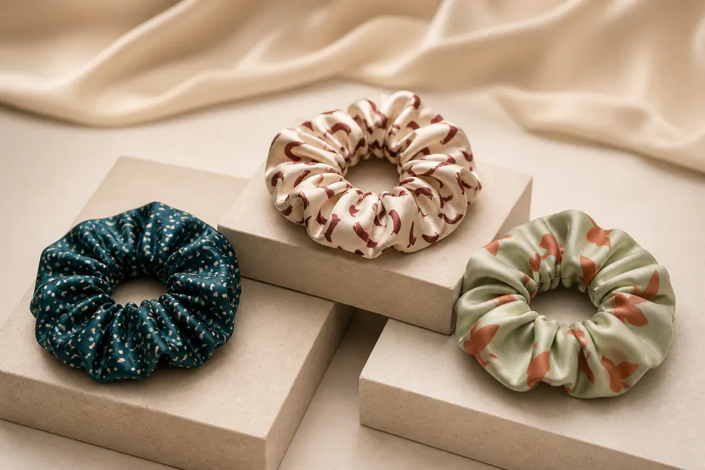
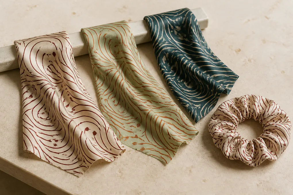
Identify the authorized artwork, printable face, repeat scale, seam, gather disruption, and color-proof question.
Lock Artwork Permission, Files, and Revision Control Before Sampling
We begin with the artwork itself, because a silk scrunchie cannot be responsibly developed from a mood-board image, a marketplace screenshot, or an old colorway with uncertain rights. We need a named file owner, a current release, any intended territory or channel limits your team has identified, and one working revision number. This discipline protects the creative concept and keeps purchasing from treating an exploratory image as a production instruction.
Identify the Artwork Owner and Working Master
Artwork authority for a custom printed silk hair accessory
The information we need before discussing a layout
We ask you to identify who controls the artwork and which file is the working master. That can be your own brand, a licensed artist, an agency, or another party authorized to give instructions. We do not assume that a photograph, a social post, a swatch, or a previous retail item gives permission to reproduce a design. For a printed silk scrunchie, the useful starting package is a usable artwork file, its revision name, color references where available, and one contact who can approve visual changes. If a pattern has alternate palettes or region-specific versions, we ask which version belongs to the requested accessory. This avoids a familiar failure: a prototype is physically correct while the creative team rejects it because the wrong revision or an obsolete palette reached the product review. A purchasing manager can state which details remain open rather than forcing a premature answer. We separate confirmed instructions from creative questions so the request stays useful without pretending unfinished work has been settled.
Translate a Flat Design Into a Cuttable Silk Strip
From digital canvas to sewn accessory geometry
Why edge allowance and focal areas need deliberate treatment
A printed scrunchie starts as a narrow sewn strip, not a flat square of fabric. We review where artwork can be cut, where a seam may consume part of the design, and whether a focal motif needs distance from the casing edge. A large flower, small lettering, stripe, border, or character can be deliberately located, allowed to fall randomly, or protected from a joining zone; each route creates a different buying brief. We also ask whether the print must read from the outside of a ponytail, around a wrist, on a carded display, or in a gift assortment. That use context changes sensible motif scale and the importance of direction. We do not promise that each loop will reveal an identical crop unless artwork, cut plan, and approval method specifically call for controlled placement. We describe the expected variation clearly and reserve final judgment for a finished sample, rather than offering a screen proof as proof of a soft gathered object.
Keep Creative Changes Traceable During Product Review
One revision trail for artwork, construction, and presentation
Preventing a silent change after an approval comment
We connect the artwork revision to the product record so an approved change does not disappear into email threads. The brief can identify the file date, visual revision, requested construction state, and whether the card, pouch, or outer pack must show a matching image or color name. When a buyer changes a background shade, enlarges a motif, removes a border, or adds a brand element, that decision should be reviewed against the gathered object—not merely against the flat file. The same record helps commercial teams compare several printed silk scrunchie variants and gives quality personnel a reference when they inspect motif direction, panel continuity, and pack content. We avoid vague wording such as “match artwork” because it invites different interpretations. A named file, a visible crop expectation, and a clear approval contact give the project a reliable visual anchor without making rights claims that only the artwork owner can grant.
Choose a Repeat and Motif Scale That Still Reads in Gathers
We evaluate the print in the relaxed and stretched states that the finished accessory will actually show. Gathering compresses some areas, opens others, and changes the distance between motifs. A pattern that feels calm across a length of flat fabric may look busy on a small loop; a tiny motif may vanish entirely. We use intended viewing distance, chosen fullness, and the print’s role in the wider assortment to shape a proposal your merchandising team can judge.
Set the Visual Scale for a Circular Hair Accessory
Motif size, spacing, and contrast in a gathered silhouette
Keeping the intended hierarchy after sewing
We begin by asking what the print needs to communicate at normal viewing distance. A scattered micro pattern, an all-over conversational motif, a broad stripe, a border, or a single larger emblem reacts differently when silk is drawn around elastic. For a brand using several hair accessories together, the scrunchie may need to read as a coordinated accent rather than as a miniature copy of a bedding print. We help separate essential visual elements from those that can be lost inside folds. A high-contrast edge can become sharp when compressed; a low-contrast detail can turn into texture rather than a recognizable motif. We discuss the relationship between repeat dimension and likely visible segment, not only the dimensions of the original artwork. Buyers who need a consistent merchandising story can share images of the desired expression, while leaving room for the physical behavior of a sewn loop. That creates a better sample question than merely asking whether the pattern looks attractive.
Decide Between Controlled Placement and Natural Variation
Engineered motif visibility versus an all-over repeat
A choice that changes what each unit can display
Some programs need a recognizable motif visible at the outer face of every scrunchie; others prefer the livelier effect of an all-over repeat that changes from piece to piece. We make that distinction early. Controlled placement needs a focal area, a cut relationship, and a review sample that proves what visible means on the completed ring. An all-over repeat needs a clear acceptance view as well, because random variation should still look intentional rather than accidental. We also consider the seam position and the point where a pattern meets itself. A checkerboard, fine stripe, or border can reveal an interruption more quickly than an organic floral or abstract print. This is a product-design choice, not a blanket quality claim. We record the selected approach in plain terms: random repeat accepted, focal motif away from seam, or outer circumference showing an approved color balance. Clear wording gives creative and quality teams a practical way to assess the result.
View the Motif in the States a Buyer Will See
Relaxed loop, expanded loop, wrist display, and card presentation
Avoiding approval from an unrepresentative flat swatch
We recommend reviewing the completed item in more than one useful position. The relaxed loop shows fold density; a gently expanded loop shows how the strip opens; a wrist position can reveal the outward face; and carded display shows the area a shopper may see before handling it. These are visual review states, not performance promises. They help a buyer decide whether the motif is legible and whether the color distribution supports the planned presentation. We keep the inspection language tied to the actual product version rather than treating a loose strike-off as complete proof. If a printed ribbon extension or another component is included, it receives its own placement discussion because it may show more of the repeat than the gathered ring. The outcome is a decision record that lets your team approve the intended appearance while understanding that each sewn unit has physical variation.
Plan Seam, Casing, and Fold Interruptions Around the Artwork
We plan the places where fabric changes direction instead of hoping a strong print will hide every construction feature. A seam, elastic channel, folded edge, and gathered fold each alter what the buyer sees. For lettering, borders, faces, stripes, or a directional story, those points can materially affect the result. We set expectations in the brief so an approved sample is judged against intended construction rather than against an impossible uninterrupted panel.
Reserve Safe Zones for Joining and Turning
Protecting critical artwork from the construction path
Where a seam can interrupt a printed story
We look for artwork elements that should not land in a joining area. These can include a central motif, a line of small lettering, a face, a framed illustration, a narrow border, or a color transition that would look abrupt if divided. A safe zone does not make the print generic; it gives the cut plan a sensible place to absorb necessary construction change. Buyers can mark protected areas directly on the artwork or describe the effect they want to preserve. When the print is non-directional or intentionally abstract, the seam may be less visually important, but it still needs a review reference. We also consider how the strip is turned and which surface will face outward. That distinction matters when one side carries the print and the reverse has a different role. Treating the seam as a design variable prevents late disagreement over a normal feature that was never discussed during artwork approval.
Balance Gather Density With Visible Print Coverage
Fullness changes the amount of artwork on display
A product relationship rather than a decorative assumption
A fuller scrunchie creates more folds and a denser silhouette; a less full version exposes a longer visual run of the printed strip. Neither is automatically better. We ask how the product should sit in the collection, what the display image needs to show, and whether the print is the main selling cue or a coordinated background. The chosen fullness also interacts with motif scale. A larger illustration may need more uninterrupted surface, while a small repeat can remain readable across denser gathering. We do not label one construction as premium or claim a fixed visual result from a catalog reference. We describe the desired appearance, choose a sample route that can demonstrate it, and record the approval point. The buyer can then compare alternatives based on visual volume, color distribution, expected placement variation, and relationship to the planned pack—not abstract language about luxury.
Set Direction for Stripes, Borders, and Narrative Art
Orientation and repeat start position around the loop
Preventing a pattern from looking accidentally reversed
Directional art needs an explicit orientation instruction. A stripe may be expected to run across the strip, along its length, or at an angle; a botanical stem may need to travel one way; and a logo-like mark may need a specified outward position. We distinguish a direction that is mandatory from one that is simply preferred. That gives the development team room to identify conflicts with loop construction before a sample is approved. We avoid promising that every gathered fold will display a directional feature identically. Instead, we establish what should remain consistent: the chosen artwork direction in the cut layout, a defined seam relationship, or the way a carded sample is presented. This protects a brand that depends on orderly visual communication while respecting the reality of a soft accessory. It also supports later inspection because staff can compare the product to a stated orientation rule rather than infer intent from a flat file.
Specify Which Silk Surface Receives the Print and Which Way It Faces
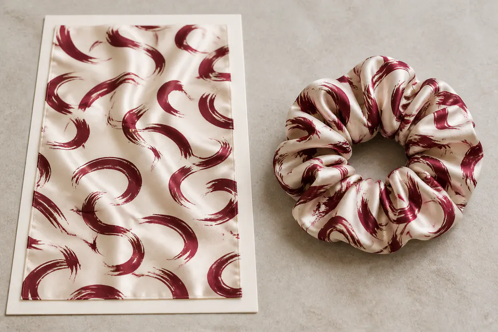
We do not collapse silk, print, and construction into one unexplained label. A buyer should state which component carries the artwork, whether the reverse is expected to be visible, and how the material is intended to face in the finished loop. Those choices influence color appearance, the way the artwork is framed, and the points a finished prototype must clarify. We keep every statement specific to the selected product instead of implying that the same arrangement belongs to every scrunchie program.
Name the Printable Component in the Product Record
Printed face, reverse face, and material-scope clarity
Avoiding a vague claim that covers more than the selected build
We ask your team to identify the component intended for print: the outer gathered shell, a ribbon extension, a decorative panel, or another specifically named surface. If the reverse is visible during wear or in a display image, that should be described too. This matters because a visual reference can make a product look as though both sides carry the same treatment when the requested construction only defines one face. We do not add a material or print claim to an unspecified component. Instead, we put the surface choice in the product brief and let the buyer confirm which component the selected instruction governs. A clear component statement also helps packaging and photography teams avoid misleading descriptions. The aim is not to overload the product page with textile jargon; it is to give a B2B buyer a clean way to connect artwork, selected surface, and expected presentation before physical review begins.
Review Printed Color With the Product’s Surface Direction
Viewing angle and luster during visual comparison
Why a color call needs a defined condition
Silk’s surface can change the way a printed color is perceived when the item is moved or viewed from another angle. We treat that as a review condition rather than as a broad performance claim. A buyer may have a brand color reference, an approved art file, or a prior collection item; each can be useful, but the sample review should identify the light setting and product state used for the decision. We also look at whether the print is expected to read most strongly on raised folds, the outer curve, or the flat carded area. If a visual effect depends on a particular orientation, we record that expectation so it can be discussed honestly. This avoids a situation where one group approves a flat proof and another judges the gathered accessory by a different visual condition. The record should say what was compared, not promise that a shade will look identical under every environment.
Keep Buyer-Facing Product Copy Aligned With the Selected Surface
Accurate handoff from development to merchandising
Selling language that does not overstate the product
We can structure the technical information that your merchandising team needs, but final selling language should describe only the selected build. If printed silk is limited to an outer face, internal copy should not imply that every visible or unseen component has the same treatment. If the item belongs to a multipack, the pack description should distinguish print variants rather than relying on one image to explain them. We keep this page focused on B2B development rather than retail promises about hair outcomes, comfort, or durability. The useful handoff is a concise set of facts: which component is printed, how the artwork is intended to appear, which variants are included, and what remains subject to final approval. That specificity makes product photography, online catalog content, and receiving documentation more consistent without adding claims that the sample and approved record do not support.
Separate Ground Shade Decisions From Printed Ink Decisions
We treat the base silk color and printed artwork colors as linked but different choices. A buyer may approve a digital palette, a physical swatch, a brand standard, or a previous collection reference; none should be treated as interchangeable without discussion. The ground can change the apparent balance of a motif, while a print can alter the way the ground reads between folds. We put both elements into the review plan so a color decision is traceable rather than reduced to a name such as blush, navy, or ivory.
Give Each Color Decision a Clear Reference
Ground, motif colors, trim colors, and visual priority
Making a buyer’s approval instruction readable
We invite buyers to state what each color reference controls. One reference may define the ground, another the principal motif, and a third the look of a label or card. If a physical swatch, color code, or approved prior item is used, the brief should identify the named component governed by that reference. This prevents a common ambiguity in printed accessories: an overall color name is passed along, but nobody knows whether it refers to the background, dominant flower, elastic, or pack. We also ask which color relationship matters most when a trade-off is required—for example, contrast between motif and ground, continuity across a multipack, or a close relationship to another product family. We do not claim universal shade consistency. We establish a comparison method and named approval reference so the buyer can assess the selected printed silk scrunchie in the context that matters to the program.
Review Ink and Ground Together on the Gathered Object
Why a digital proof is not the final color decision
Bringing product form into the color conversation
A digital proof is valuable for checking artwork content, but it cannot answer every question about how color will read on a gathered silk accessory. Folds divide the field of color, change the apparent proportion of a motif, and can make a darker or lighter area more prominent than it appears on screen. We distinguish artwork approval from product-color approval. The finished sample should be reviewed against the chosen reference in a stated visual condition, with attention to the outer visible face and any matching display component. If the assortment includes several prints, we also look at how they sit together as a group. The goal is not an undefined ideal under every light source. It is a repeatable way to say which relationship is accepted for the requested product, then carry that decision forward without relying on memory or subjective color names alone.
Record Palette Updates at the Variant Level
Revision notes for artwork, trim, and presentation materials
Keeping one colorway from being mistaken for another
When a color changes, we connect the change to the particular scrunchie variant rather than treating it as a general instruction for the whole collection. A new background shade might require different motif contrast; a revised label may need a different card color; and a multipack sequence may need to be reconsidered. We record the updated reference, the component affected, and whether the earlier sample remains a valid comparison. This is especially helpful for buyers balancing creative approval with packing and catalog deadlines. It prevents a purchasing order from carrying an older palette after the brand team has moved on. We also leave unconfirmed color values open until the relevant party approves them. Honest open points are more useful than a finished-looking document that hides a decision nobody has actually made.
Approve Strike-Offs and Finished Samples as Different Review Stages
We separate the printed fabric conversation from the finished scrunchie conversation. A strike-off can help your team assess artwork content, scale, and color direction; the sewn loop reveals gathers, seam interruption, elastic behavior, and final presentation. Treating them as the same approval stage can leave key product questions unanswered. We define what each item should prove so your team can move forward without confusing an early visual check with a complete accessory decision. We also identify the reviewer responsible for each question, so creative approval is not mistaken for packaging or purchasing approval.
Use a Strike-Off to Examine Artwork Before Construction
Flat print review for content, repeat, and color direction
What a textile sample can answer well
We use a strike-off to review questions that belong to the flat artwork and printable surface. Your team can check whether the correct revision was used, whether the repeat is recognizably in the intended scale, whether protected visual areas have been considered, and whether the color direction suits the proposed ground. A strike-off is also a useful point to catch a file issue before it is built into an accessory. It should not be presented as proof of the final gathered appearance, elastic response, seam position, or pack layout. We state that boundary plainly in review notes. Buyers can approve the items the strike-off genuinely represents and reserve construction-dependent decisions for the sewn sample. This keeps the process efficient while protecting the team from a false sense that every product question has already been closed.
Use the Finished Loop to Judge the Selling Product
Construction, visual distribution, and display-state review
Why the gathered object needs its own record
The finished sample lets the buyer inspect the product form rather than an isolated material. We look at how the print distributes around the loop, whether the seam appears where expected, how the selected elastic relates to gathered volume, and how the accessory looks in its intended display method. If a ribbon, label, or other add-on is part of the requested design, it should be present in the sample or clearly marked as open. We also confirm the sample’s variant identity so teams do not compare a revised print to an earlier construction without noticing the difference. The buyer can decide which observations are approval criteria and which are topics for another revision. That is more useful than a broad approved or rejected response with no explanation of whether the concern relates to artwork, construction, pack, or a missing decision.
Write Sample Comments That Become Product Instructions
Location, condition, and desired change in each comment
Turning visual reactions into usable requests
We encourage comments that name product condition, location, and intended change. “Make the print better” is difficult to act on; “move the border away from the joining area,” “reduce the central motif scale,” or “confirm the outward face for the carded version” gives the next review a purpose. A buyer can also indicate whether a comment is mandatory, preferred, or a question needing clarification. This prevents a minor styling preference from becoming a binding commercial requirement—or a critical artwork issue from being lost in casual feedback. We retain the connection between each comment and its sample or artwork revision. This documentation safeguards buyer intent when several teams participate in approving a custom printed silk hair accessory and ensures the next item is evaluated against a known request.
Define Strip Width, Loop Circumference, and Fullness Without Borrowing Another SKU
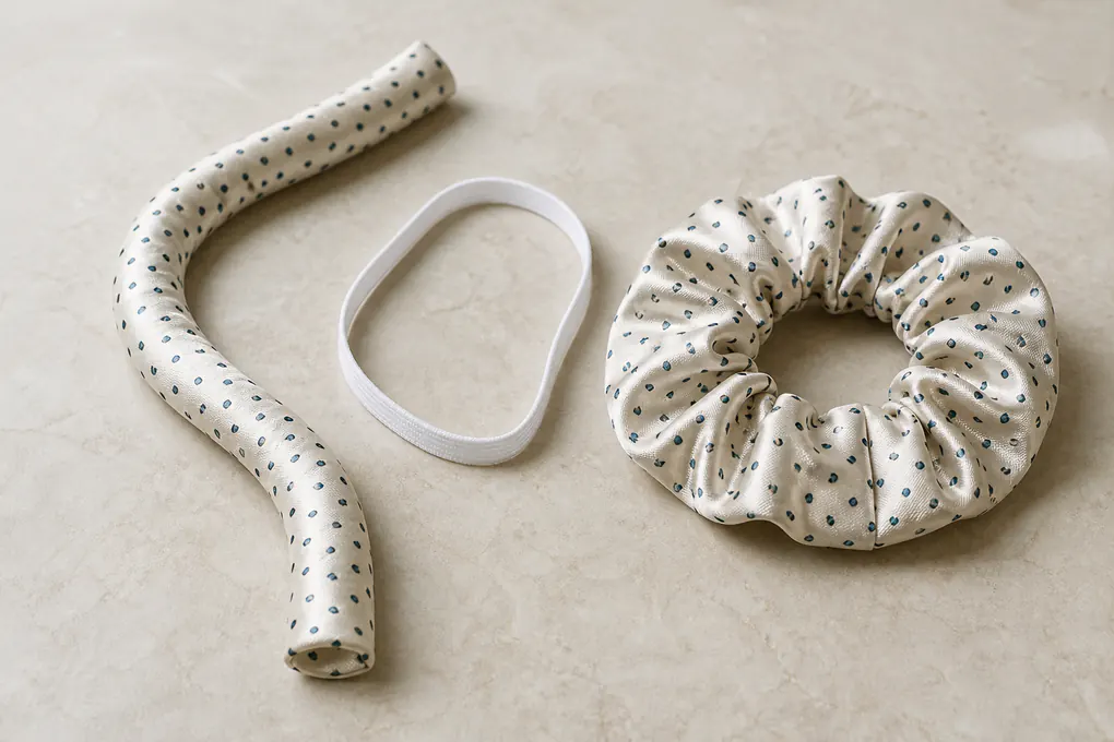
We treat a printed scrunchie as its own product specification, not as a smaller version of a pillowcase print or a renamed plain accessory. Cut-strip width, finished loop circumference, and gathered fabric volume work together. A number copied from another item can change the way a motif appears, the visual volume, and the display footprint. We ask for the intended variant and use state before attaching measurements to the brief. Where a buyer has a target measurement, we record its unit and condition rather than relying on an unlabeled sketch.
State the Measurement Points That Define the Variant
Unstretched loop, strip width, and stated product condition
Removing ambiguity from a familiar accessory name
The term scrunchie does not define a finished size. We ask whether the buyer is describing a relaxed loop, expanded loop, visible gathered width, cut strip, or carded presentation dimension. Each can be relevant, but each refers to a different condition. We write the measuring point and state alongside any requested value. This prevents a sample discussion from becoming an argument over whether a number was taken before or after gathering, or whether a visual width referred to the fabric strip or finished folds. We also distinguish a new printed variant from a separate product family such as a narrow tie, ribbon accessory, or larger statement loop. Direct naming helps buyers build a range without allowing product descriptions to blur together. The final record should make it clear which dimensions are fixed, which are review inputs, and which remain open for the buyer to decide.
Match Visual Volume to the Intended Presentation
Fullness, print visibility, and pack footprint
Choosing an accessory expression rather than a generic dimension
We ask what role the printed scrunchie should play when displayed. A compact piece in a multi-unit card can call for a different gathered volume than a giftable standalone accessory photographed from several angles. The print must still remain meaningful within that silhouette. A bold motif can feel crowded when folds are dense, while a delicate repeat may need enough visible surface to be recognized. We use these questions to shape a sample request, not to impose a universal dimension. The buyer can describe an existing assortment reference, a target image, or the intended packaging footprint. We then record which parts are fixed and which can be proposed. That gives a stronger commercial foundation than lifting a measurement from a nearby product and assuming it will create the same visual outcome on a printed silk loop.
Keep Variant Names Specific When a Range Expands
Separating prints, widths, and accessory formats
A usable naming system for purchasing and receiving
When a range includes several prints, widths, or presentation formats, we give each requested variant a distinct working identity. That identity can combine your internal style reference with the print revision, colorway, and size designation. The purpose is not a complicated naming exercise; it is to make sure the sample, packing information, artwork, and receiving expectation refer to the same item. A printed scrunchie with a different strip width may reveal the repeat differently even when it uses the same art. A version with a ribbon extension needs its own visual and pack review. By naming these differences clearly, we help a purchasing manager compare configurations without carrying a construction instruction from one item into another. The final product record can show what is shared across the range and what belongs only to one requested style.
Set Elastic Behavior and Gather Recovery as Product Decisions
We do not describe elastic with vague words such as strong, soft, or durable and leave the buyer to interpret them later. The elastic inside a gathered scrunchie influences relaxed silhouette, opening, fold return, and visual balance of the printed surface. We identify the use state your team cares about and define the sample observations that matter. This makes the request more useful than a generic claim about accessory performance. The product record also distinguishes a visible-shell question from an internal-component question so reviewers can give focused comments. It gives an operations team a stated basis for approving the particular accessory instead of a broad adjective.
Describe the Opening and Return You Need to Review
Elastic function in relation to the finished silk loop
Turning subjective feel into a product question
We ask the buyer to describe intended use context and the behavior that needs review. Your team may care about the relaxed look after display handling, the amount the loop opens for a particular styling context, or the way gathers distribute after gentle expansion. We do not infer a universal recovery standard, because the relevant expectation depends on selected product, desired visual fullness, and the user scenario you have defined. Instead, we identify the state in which the sample should be observed and the features that should be compared. The buyer can say that outer folds should remain evenly distributed after an agreed handling sequence, or that the sample should demonstrate a requested opening range. The language remains product-specific and avoids claims that go beyond the defined test or review.
Link Elastic Choice to Printed Shell Geometry
Casing, stretch, fold density, and outward presentation
Why an internal component cannot be selected alone
The elastic and textile shell are connected. A different internal length or tension can change how much fabric gathers, where a pattern becomes visible, and how the loop sits when carded or photographed. We look at that relationship before a buyer treats elastic as a hidden component with no visual consequence. The construction record can state the selected route, any expected range the buyer wants to review, and the condition in which it will be assessed. If the program includes more than one size or print format, we ask whether the same behavior is expected across them or whether each needs a separate check. This avoids transferring a decision from a plain accessory to a printed, fuller, or differently proportioned product without reviewing the effect. Clear linkage also gives quality personnel a focused observation instead of an undefined instruction to judge “good elasticity.”
Resolve Open Elastic Questions on a Finished Sample
Observed behavior before a commercial instruction is finalized
Separating buyer priorities from unsupported promises
We use the completed sample to resolve questions that artwork or construction notes cannot answer alone. The buyer can examine the loop after an agreed handling sequence, compare gather density with the intended visual reference, and decide whether opening and return suit the selected product concept. If a change is requested, we document what changed and why: a different visual volume, a different opening expectation, or a conflict with print presentation. We do not use a sample observation to make unsupported claims about all users, all conditions, or long-term performance. The practical goal is more useful: give the purchasing team a defined product state, a record of what was reviewed, and an unambiguous next step before the accessory is included in a buying decision.
Separate Print Variants, Size Variants, and Product Formats in One Range
We help buyers prevent a colorway, a size, and a different construction from being treated as the same SKU. Printed silk scrunchie ranges can expand quickly: one artwork can appear in several palettes, one visual family can include another width, and a matching accessory may add a ribbon or altered presentation. Each difference can affect artwork placement, pack content, labels, imagery, and receiving checks. We identify the variant logic before a quote or sample set is compared. That work is especially useful when a commercial team enters several closely related lines into one seasonal buy. A clear matrix also reduces rework when artwork and pack decisions arrive at different times.
Build a Variant Matrix a Buying Team Can Read
Artwork revision, colorway, size, and pack route in one view
Making differences visible before they become order errors
We recommend a simple matrix for the requested range. Each row can identify working style name, artwork revision, colorway, selected size or width, special construction feature, and presentation route. The matrix is not a replacement for detailed product information; it is a way for creative, purchasing, and quality teams to see where one decision changes another. A new colorway may use the same repeat but need a different label or card image. A new width may use the same art but need a revised placement view. A separate product format should not be hidden under a color code merely because it belongs to the same collection. We use the matrix to keep comparisons honest and make a quote-ready request easier to review. It reduces the likelihood that a comment about one item is unintentionally applied throughout the printed accessory assortment.
Define What Must Match Across the Collection
Shared visual rules and variant-specific exceptions
Protecting coherence without forcing sameness
A buyer may want all variants to share a particular visual relationship: the same artwork family, common card format, aligned color story, or consistent labeling hierarchy. We identify those common rules separately from details that must change for an individual product. Forced sameness can damage a small accessory. A motif that works on a wider gathered loop may not read well on a narrower one; a multipack may need a different display order than a standalone item; and a ribbon extension can reveal a much larger portion of the print. We do not solve these differences by hiding them in broad copy. We name the collection rule, then name the variation. That gives the brand team a coherent system and gives purchasing a precise method for requesting an exception without losing the product family.
Give Each Variant Its Own Approval and Receiving Identity
Sample labels, pack identifiers, and inspection references
Keeping a collection orderly from prototype to delivery
Each final variant needs an identity that follows it through sample review, artwork confirmation, packaging development, and receiving. We can use your internal code, working development name, or another approved identifier; the important point is distinguishing the requested product accurately. The sample label should not leave a quality reviewer guessing which art, colorway, or format it represents. Pack materials should not show an image that could be mistaken for another member of the range. When goods are checked, the comparison reference should point to the correct variant rather than a generalized collection description. This discipline is particularly valuable for assortments, because an apparently small mix-up can change the selling unit. We keep the record practical, readable, and tied to the item actually being purchased.
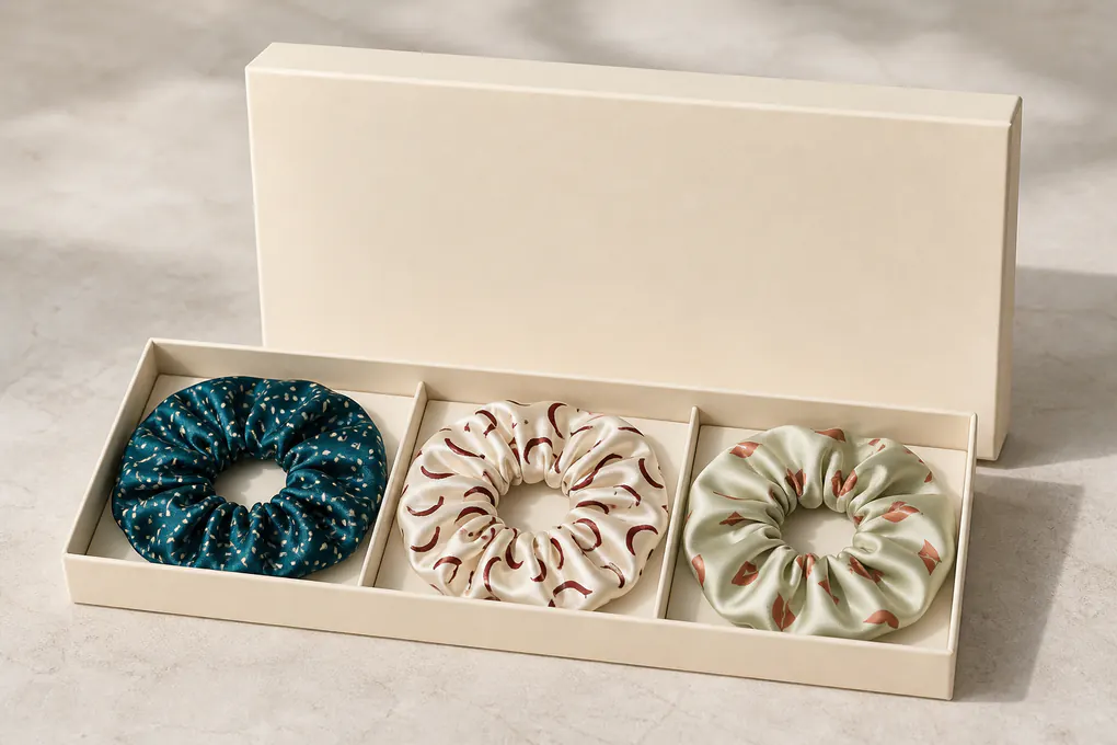
Specify Labels, Multipacks, and Display Presentation Alongside the Product
We include presentation details early because a printed silk scrunchie is often sold as an accessory set, a carded item, or a giftable component. Labels, piece counts, pack order, barcodes, and display imagery can change a commercial decision even when the sewn loop is unchanged. We ask what the customer-facing unit must contain and what information must travel with it, then connect those instructions to the correct print and variant instead of treating packaging as an afterthought. The same clarity helps warehouse teams distinguish a mixed assortment from visually similar single-style packs. It also makes item photography and digital catalog checks easier to reconcile with physical receipt.
Describe the Selling Unit Before Packing Instructions
Single accessory, paired item, or curated multipack
Defining what the buyer intends to receive and sell
We begin with the selling unit. Is the request for one printed silk scrunchie, a pair of coordinated pieces, a mixed-color group, or a set that includes another accessory? The answer affects pack count, visual arrangement, identification, and the sample your team needs to approve. We also ask whether the item will be carded, placed in a pouch, packed in a box, or supplied within a larger gift configuration. Each format exposes a different part of the print and can make a different feature commercially important. We do not assume a generic pack from a product image. The buyer should define required presentation or state that it is open for discussion. With that information, product and packaging conversations can move together without promising a finished display that has not been selected.
Connect Label Content to the Exact Variant
Identity, artwork name, colorway, and buyer-controlled branding
Avoiding labels that describe the wrong accessory
A label, card, barcode sticker, or insert should identify the configuration it accompanies. We ask the buyer to provide approved brand elements and the information their channel requires, then connect those materials to the correct style and pack. If a multipack mixes prints, the pack description should make the mix clear; if a single item has a distinctive artwork name, that name should not be applied to another colorway by habit. We do not write unverified material, benefit, or performance statements into a label route. The focus is accurate identification and buyer-approved presentation. During sample review, the team can compare card position, label location, visual balance, and pack information with the intended selling unit. This helps avoid a late mismatch where a correct accessory reaches the buyer with packaging that belongs to another item in the collection.
Review Pack Order and Display Orientation
How a printed accessory is first seen
A controlled comparison between mockup and sample
For a coordinated pack, order of colors and prints can matter as much as individual pieces. We ask whether arrangement is fixed, whether variations are acceptable, and which face should be outward on the card or in the pouch. A display image can explain the intended composition, but written information should still name sequence and item identity. We also consider whether outer pack needs a visual cue to distinguish similar variants in a warehouse or retail environment. These are practical buying questions, not decorative extras. A pack that looks cohesive in a flat mockup can become confusing once several gathered loops overlap. By reviewing a physical or clearly represented pack state, your team can confirm presentation before the information is used in ordering or receiving.
Build a Sample Sequence That Resolves the Highest-Risk Questions First
We help buyers avoid spending review time on details that cannot yet be judged. A printed silk scrunchie project may have open questions about rights, motif scale, color direction, seam relationship, elastic behavior, or packaging. Rather than treating every sample as final, we identify what each stage must prove. The sequence can move from artwork clarification to a visual textile check, a finished accessory review, and a pack review where needed, with every revision tied back to the precise product variant. This gives a procurement lead a direct view of which approval blocks the next commercial decision. It also protects the sample budget from revisions caused by an unanswered upstream question.
Rank Decisions That Could Change the Product Most
Artwork, construction, color, and presentation risk in order
Directing buyer attention to the critical decision first
We ask the buyer to identify which unanswered decision would most affect the requested product. If artwork authority or the working file is unresolved, that belongs before a physical request. If the repeat is confirmed but gathered effect is uncertain, a finished-loop review may be next. If the core accessory is accepted but multipack is undecided, pack review should be separated from primary approval. This order keeps feedback meaningful and avoids a long list of changes that combines unrelated questions. We do not claim one sequence fits every buyer. We build the sequence around the particular printed silk scrunchie, teams involved, and the evidence each team needs for its decision. The result can be a clearer commercial request because it shows what is fixed, what stage is being requested, and what buying choice is waiting on the result.
Make Each Review Note Usable in the Next Revision
Location, product state, desired result, and owner
Replacing broad reactions with clear instructions
We encourage reviewers to write comments identifying precise product area and intended result. A comment can say that a motif should sit farther from the seam, that a color relationship should be reassessed in the gathered state, or that the card should show another outward face. The reviewer can classify the note as required, comparative, or awaiting a decision. This protects both buyer and product team from treating every observation as the same type of instruction. It also lets creative lead, product manager, and quality reviewer contribute without overwriting one another’s decisions. We retain the link between each comment and the sample or artwork revision, so the next item can be evaluated against a known request rather than an incomplete recollection of a meeting.
Close a Stage Only When Its Own Questions Are Answered
A disciplined handoff from visual approval to buying instruction
Keeping unresolved matters visible rather than hidden
We close a review stage by recording what was accepted, what changed, and what remains open. A strike-off may resolve artwork content while leaving elastic and pack decisions open. A sewn sample may settle gathered appearance while a colorway still needs a revised reference. This is not a weakness; it is a truthful way to manage a complex accessory. Buyers gain a record they can use for internal approval or commercial comparison. We avoid filling open fields with invented tolerances, schedules, production assumptions, price, or regulatory statements merely to make the document look complete. A focused list of unresolved items is safer than a polished specification whose facts cannot be verified. Once identified questions have been answered, the next step can be requested with a clearer product definition and fewer surprises.
Prepare a Quote-Ready Record and Receiving Checks for the Approved Configuration
We finish with a record that lets a buyer request a comparable commercial review and later check that received goods match the approved configuration. The aim is not to bury a silk scrunchie in generic quality language. It is to name the few features that control identity: artwork revision, printable surface, repeat expectation, selected dimensions, elastic and gathered presentation, variant code, label route, pack composition, and the sample or visual reference used for approval. The record can accompany internal purchase review without disclosing unsupported commercial terms on a public product page. It also gives teams a controlled reference if the product is replenished after the original review cycle.
Assemble the Information a Comparable Quote Needs
A practical B2B RFQ for a printed silk scrunchie
What to send for a defined commercial discussion
A quote-ready request identifies a particular product, not a broad category. We ask for artwork revision or a statement that artwork is pending, intended print surface, selected variant or range, relevant size description, placement expectation, packaging route, destination market, quantity context, and the decision date that matters to the buyer. If a requirement is unknown, it should be marked open rather than silently guessed. We also ask whether a sample is needed and what it must demonstrate. This lets commercial discussion focus on the actual configuration instead of comparing unaligned assumptions. We do not publish retail prices, default minimums, output commitments, schedule promises, regulatory scope, or performance guarantees on this page. Those matters require a buyer-selected configuration and written review. The useful starting point is a complete product question with clear ownership of choices still to be made.
Inspect the Features That Define This Printed Accessory
Artwork, gathering, seam, elastic, variant, label, and pack checks
Receiving against an approved reference rather than a generic list
For receiving and quality review, we focus on product-specific items that a generic checklist can miss. The inspector can confirm variant identity, compare printed artwork with the approved visual reference, look at motif distribution in finished gathers, observe seam and any designated safe zone, check selected loop and elastic presentation, and verify labels and pack contents against requested selling unit. The comparison should state what was checked, where it was observed, and which approved reference applies. If several colors or formats are included, the inspection plan should make sure they are not treated as one undifferentiated group. We do not invent acceptance limits after goods are made. Buyer and product teams should agree relevant observations and measurable methods before that point, then retain the reference for consistent review.
Keep the Final Record Useful for Reorders and Range Changes
A disciplined product history without boilerplate
Protecting the approved direction over time
After the first approved configuration, the final record helps a buyer distinguish a true reorder from a new variant. It can retain artwork revision, selected print relationship, construction notes, sample approval reference, label and pack route, and any open question deliberately excluded. If a new colorway, width, motif scale, or presentation format is introduced later, it can be compared with the existing record without assuming it is identical. This protects the collection from gradual drift and helps a purchasing manager explain changes to internal teams. We keep language grounded in the approved product rather than adding broad promises about every future accessory. A clear, product-specific history is more valuable: it tells your team what was selected, what was reviewed, and what must be reconsidered when the printed silk scrunchie range develops further.
Questions buyers ask when commissioning printed silk scrunchies
Can a flat artwork proof show exactly how a gathered scrunchie will look?
No. A flat proof helps review artwork, but the completed loop is needed to assess folds, seam interruption, visible repeat, elastic relationship, and intended display state.
Should every printed scrunchie show the same crop of a repeat?
Only if controlled placement is specifically selected and reviewed. An all-over repeat can vary intentionally when the expected variation is described and accepted on the finished product.
What should a printed silk scrunchie RFQ include?
Include artwork status and revision, product format, printable surface, placement expectation, variants, packaging direction, quantity context, destination market, and the question a sample must answer.