
P011
Two-Face Pillowcase Concept Development
A two-face pillowcase is not a single-material product with a second color. It is a sewn article in which both visible sides, the opening, edge, labels, pack, and retail explanation need to work together. We help bedding buyers turn that idea into a usable B2B brief: define what each side is meant to do, where the customer sees or touches it, how the case turns around an insert, and which physical sample decisions must be made before a bulk discussion. Start with the feature that is delaying your range review—material pairing, closure exposure, face orientation, color balance, fit, or packaging—and we will focus the conversation on that specific decision.
Published by China EverBen Silks Reviewed by Mark Liu
Define both sides before a reversible pillowcase is compared
State the face relationship, closure, edge, color or print map, and finished orientation.

Define the Job of Face A and Face B Before You Call a Pillowcase Reversible
We begin a two-face pillowcase program by naming the customer reason for each side. One face may give a bedding range a different color story, a different silk surface, a coordinated print, or a deliberate contrast for a gift set. The reverse cannot be treated as a hidden lining if the customer is expected to turn the case over and use it. That distinction changes the construction conversation. A buyer needs to decide whether both sides will be visible in retail photography, whether both sides contact the user, whether one side has a directional pattern, and what should happen when the case is opened, filled, folded, or placed in its selling unit. Clear answers prevent an attractive sketch from becoming a confusing finished product.
Give each visible side a product identity
Face-specific material, color, print, and use direction
A range concept that does not hide a second construction
We ask the buying team to name Face A and Face B as distinct construction panels. For each side, state the intended material wording, fabric direction where known, color or artwork reference, surface expectation, and role in the collection. A silk face and a contrasting textile face are not interchangeable descriptions; neither are two silk faces with different weights, weaves, or prints. The customer-facing story should reflect the article actually being developed. If Face A is the hero side for photography while Face B is designed for a calmer room setting, that is useful merchandising information. It also tells the development team which side needs the most careful placement of a flange, label, print, or color transition.
A good two-face brief does not require every commercial decision to be final on day one. It does require the buyer to distinguish a fixed requirement from an open option. For example, a brand may know that both faces must be silk but still be comparing a solid-and-print pairing against two solids. Record those as alternatives rather than allowing a supplier to blend them into one generic quotation. That gives product, creative, and purchasing teams a shared way to compare samples. It also prevents retail copy from implying a material or color arrangement that belongs only to an early reference image.
Decide whether the reverse is decorative, functional, or fully wearable
Retail story and sleep-use scenario
Two usable orientations need more than a flipped photograph
Some projects need an alternate look for a made bed, while others ask the customer to sleep on either face. Those are different products. A decorative reverse may carry a contrast color or secondary motif without needing the same contact, closure, or label experience as the primary side. A fully wearable two-face pillowcase has a higher practical standard: the opening must remain accessible, labels must not become intrusive, and the edge should look intentional whichever side is up. We recommend that buyers state the intended use in plain language rather than relying on the word reversible to cover several possible expectations.
The decision affects every subsequent choice. If both faces are meant to be used, the sample review should include turning the case inside out, inserting the nominated pillow form, closing it, positioning it on a bed, and inspecting the visible edges from both directions. If only one face is for sleep contact, the product copy, hangtag, and pack should not create a stronger promise than the selected configuration supports. Thinking through the customer’s actual handling sequence early reduces late changes to labels, closure placement, and packaging photography.
Make a two-orientation drawing before sampling
Front, reverse, opening, edge, and label map
A visual instruction that sewing and merchandising can both use
We recommend a simple drawing or marked reference for the assembled case. It should show which panel is Face A, which is Face B, the finished orientation, the opening location, the edge treatment, label placement, and any direction-sensitive print or border. The drawing does not need to be a complicated technical file at the first inquiry stage, but it should show enough to prevent a question such as “which side is the front?” from reaching a sewing team unanswered. When artwork or contrasting materials are involved, the marked orientation becomes more useful than a collage of separate swatches.
Use the same drawing during product and marketing review. Merchandising can see whether the promised two-face story is visible after the case is filled, while quality reviewers can identify the junctions that need attention. If a buyer changes the primary retail face, record the revision instead of assuming the factory, photographer, and pack designer will infer it. That disciplined handoff is especially valuable when one collection includes several coordinated two-face colorways, each with its own retail name but the same basic construction.
Choose Silk and Companion Materials Without Blurring What the Buyer Receives
The strongest two-face pillowcase descriptions are component-specific. Buyers often arrive with a familiar category phrase such as silk reversible pillowcase, yet the phrase may be covering several decisions: silk on both faces, silk only on one face, a silk face with a complementary textile reverse, a hidden lining, or a trim that changes the feel and appearance around the edge. We help teams separate those components before product claims, product listings, or pack copy are drafted. This protects the customer from ambiguity and protects the buyer from comparing quotations that assume different constructions. A material pairing should earn its place because it creates a desired use, aesthetic, hand, or range relationship—not because it sounds more elaborate on a listing.
Build a component list that matches the sewn article
Faces, inner construction, closure tape, piping, labels, and thread
No broad silk wording for a mixed construction
We encourage buyers to list the components they can see or feel on the completed pillowcase. Start with Face A and Face B, then consider any inner layer, edge binding, piping, zipper tape, flap reinforcement, labels, and decorative trim. Each component can have its own material and color question. The exercise is practical rather than bureaucratic: a customer who turns the case over may encounter a label, a zipper pull, or an edge finish that changes the product experience. A component list gives the buyer a place to state what needs approval rather than using one broad product term that could be read several ways.
Where a material is still undecided, say so openly in the inquiry. A supplier can then discuss the implications of the candidate options on the finished article without presenting an assumption as a confirmed specification. The buyer should keep material statements attached to the component they actually describe. That approach makes retail copy more accurate, helps pack artwork avoid overreach, and gives internal reviewers a clear record when a sample is compared with the original brief.
Compare pairings on the finished pillowcase, not only on loose swatches
Surface relationship, drape, edge bulk, and visible balance
A compelling contrast still has to turn through a seam
Loose fabric cards may suggest an appealing pairing, yet a completed reversible case experiences altogether different handling. It is folded for packing, filled around an insert, drawn through its opening, wrapped at corners, and seen under shifting bedroom light. We ask buyers to evaluate candidate faces on a sewn sample whenever practical. Look for an intentional contrast at the perimeter, compatible tension between panels, and a joined article that looks coherent when Face A and Face B exchange positions. That test can expose a construction concern hidden by an attractive flat board.
The review should focus on the buyer’s selected product goal. A high-contrast reversible design may need the edge to create a deliberate frame, while a quiet tonal pairing may need the join to disappear. A material difference can also influence the fold and opening experience. Rather than claim a universal result, we help the buyer define the specific visual and handling questions that the sample must answer. That produces useful feedback for the next development step and keeps the two-face concept connected to a physical object.
Keep fiber and care statements inside their real scope
Product copy that names the selected configuration
Accurate language survives a retailer data-sheet review
A material statement should tell the reader what it applies to. When both faces are silk, the selected construction can be described accordingly once the buyer and supplier have agreed the component detail. When the faces differ, wording needs to identify the relevant face or component rather than imply that every visible and hidden part shares the same composition. The same principle applies to any care direction: it should be based on the selected construction and intended labeling route, not copied from an unrelated sample or general category page.
We suggest reviewing the product name, packaging copy, web listing, and care label together before release. Check that each one refers to the same selected version and that no phrase silently expands from one face to the whole case. This is not about making copy cautious for its own sake; it is how a buyer avoids a retail return, a marketplace dispute, or a customer-service question caused by wording that was never tied back to the actual sewn article.
Set Fabric Weight, Weave, and Hand Expectations for a Balanced Two-Face Pillowcase
Two silk panels may look harmonious on a colour card but become visually uneven after they are sewn into one reversible case. Their weight, weave, finish, and surface character affect drape, movement through the opening, corner shape, and the visual prominence of each side. We help B2B teams define the preferred fabric route as an intentional product choice. A catalogue reference is useful for opening a conversation, yet it cannot stand in for the configuration selected for sampling. Buyers should describe the desired hand, decide whether the two faces need comparable body, and assess how a contrast surface appears on a filled pillow.
Use momme references as a discussion start, not a catch-all specification
Selected silk face, intended surface, and product context
The finished sample remains the meaningful comparison
Momme becomes meaningful only when it is linked to a named silk panel and a defined construction. By itself, it cannot capture every quality a reversible pillowcase buyer must judge. Fabrics at similar nominal weights can vary in weave, finish, dye response, body, and reflected surface. Ask the sample to demonstrate a specific purchase requirement: controlled sheen, a lighter or fuller hand, balanced behaviour across both faces, or a contrast that remains purposeful after the case is turned. That approach directs the conversation to the finished item instead of an isolated number.
If a range uses more than one fabric direction, identify which one belongs to each SKU. A buyer may choose a uniform silk route across both faces for a calm, symmetrical presentation, or may intentionally select a different hand for the reverse. In either case, the purchase brief should state the selected option, the application, and the visual question for sample review. That keeps later product photography, pack copy, and quality checks tied to the exact finished article.
Assess drape and face balance around an insert
Filled shape, corners, opening turn, and bed presentation
The article must look considered from both sides
A two-face pillowcase is judged on a pillow, not only flat on a cutting table. We recommend checking each candidate construction over the intended insert type and approximate fill condition. Observe where one face pulls or relaxes differently, whether the edge reads cleanly, and whether the case shows a stable form when it is flipped. A fabric with a very different body may create an interesting contrast, but it can also make the article twist, shift, or make one side look like an interior rather than an equal face. The buyer should decide which result supports the range story.
This review is also where corners and decorative edges become meaningful. A soft edge may blend two faces together, while a stronger border may exaggerate their difference. Neither answer is automatically right. The important point is to sample and comment on the finished, filled article. Record observations in plain product terms—edge is too bulky in Face B orientation, border needs a narrower visual line, two faces need closer body—so the next revision answers a physical problem rather than a vague request for more luxury.
Plan color and surface variation with silk’s changing light response
Luster, shadow, tonal contrast, and retail imagery
A screen mock-up cannot predict a made-bed view
Silk reflects light differently over folds, so the same colour reference can appear richer or paler when the surface direction changes. A reversible design magnifies this effect because two panels and their joining edge are evaluated together. We ask creative teams to choose between strong contrast, tonal reversibility, or a print-solid pairing, then inspect candidate fabrics in conditions relevant to their route to market. A screen image can help describe an idea; where appearance drives the buying decision, the sewn sample is the meaningful reference.
For a two-face range, link the color or print reference to a named face, sample version, and SKU. This makes it easier to keep a limited-edition colorway separate from a core solid, and it prevents a face-specific visual effect from being applied to the opposite side in pack artwork. If a customer will be shown the product folded to reveal both faces, include that presentation in the sample review. It is the best way to see whether the selected fabrics support the brand’s intended first impression.
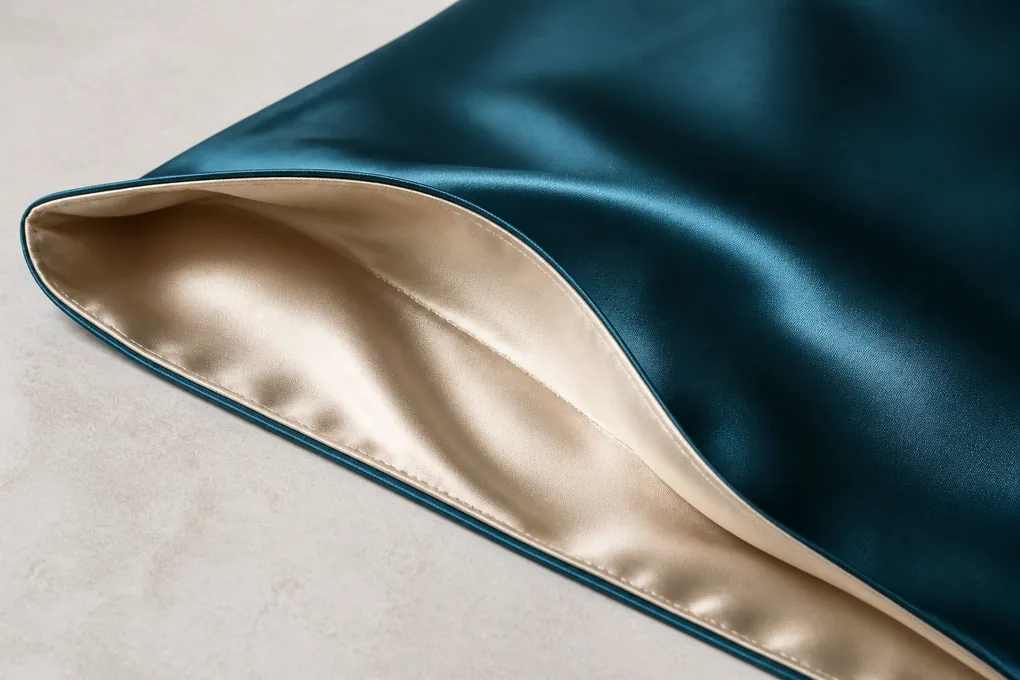
Plan Face Orientation, Color Contrast, and Print Direction for Real Bed Presentation
A reversible pillowcase only helps a bedding range when customers can immediately understand what changes when they turn it over. That change may be a new color, a quieter side for the back of a bed, a printed face paired with a coordinating solid, or a contrasting texture that makes a gift set feel more versatile. We help buyers turn this visual concept into orientation rules. Directional artwork, centered motifs, borders, logos, and color-blocked panels need a defined relationship to the opening and edge. Without it, two units can be sewn correctly in a general sense but look inconsistent in a retail display or product photography.
Name the primary retail face without denying the second face
Merchandising hierarchy and on-bed use
A dual-purpose article needs a clear visual entry point
Most reversible styles still need a lead retail presentation. Decide which face appears on the pack front, which orientation leads e-commerce photography, and why the alternate view matters to the customer. That choice does not reduce Face B; it gives the product story a clear centre. A quieter reverse may make the sale, while a bolder printed side creates the first visual invitation. Capture that relationship in the launch brief so photography, product copy, and packaging communicate one consistent proposition.
The primary face may also influence how a pillowcase is folded for display. If the sales team needs both sides visible before opening, the fold, label window, or packaging insert should be considered alongside the case construction. A buyer who waits until final packaging artwork to decide which face is presented can discover that the selected opening or label position interrupts the intended view. We recommend checking the on-bed and in-pack orientation during the first assembled sample review.
Control directional prints and borders across both sides
Motif placement, grain direction, and cut orientation
Artwork should remain intentional after the case is reversed
A non-directional all-over print is often simpler to place than a stripe, border, floral stem, logo-like mark, or centered motif. If a two-face pillowcase includes directional artwork, the buyer needs to state how it should read when the opening is at the back, how it relates to the alternate face, and where variation is acceptable. A border may look well centered on Face A but become visually awkward when Face B is presented. A marked artwork placement reference is more valuable than a verbal instruction because it gives cutting and sewing teams the same visual target.
Ask to see a sewn sample in the actual finished orientation. Check the placement after the case has been turned, closed, filled, and placed on the intended pillow form. This reveals whether the motif migrates toward an edge, breaks at a seam, or visually competes with the second face. If an exact centered placement is required, put it in the project brief and review it as a named sample criterion. If reasonable variation is acceptable, define that boundary before a supplier prepares production artwork.
Build colorways that remain identifiable through fulfillment
SKU map, face pairing, and pack cue
A range should not depend on memory or thumbnail images
When multiple reversible colorways are planned, each selling unit needs a clear internal identity. Record the Face A color or print, Face B color or print, edge or closure color where relevant, and retail colorway name in one SKU map. This helps the buyer avoid a common mistake: units with the same primary face are packed under the same label even though the reverse differs. It also gives warehouse, quality, and customer-service teams a concrete way to identify the product without opening every pack.
The SKU map should travel with the color approval record and packaging artwork. It can be simple, but it must show the selected pair rather than a generic palette. If a collection offers a core solid paired with seasonal prints, make that difference visible in the item code and pack cue. The result is not more paperwork; it is a practical control that keeps a reversible promise meaningful when a buyer reorders, photographs, ships, or sells the product through more than one channel.
Specify Finished Size and Pillow Insert Relationship for Both Usable Faces
A two-face pillowcase still has to fit the insert it is sold or photographed with. Buyers should not let the reversible concept distract from the basic geometry that creates a tidy, useful bed product: finished width and length, intended insert dimensions, fill condition, edge allowance, opening location, and the way both faces sit once the case is filled. Regional size names are not enough. A Queen pillowcase, for example, may represent different dimensions across markets, and an insert’s loft changes the apparent fit even when the flat case measurement is unchanged. We work from numeric product information so the two-face design can be judged as a real bedding article rather than a decorative sample.
Use numeric dimensions and named measuring points
Finished case, insert reference, and edge condition
Clear measurements make quotations comparable
A complete pillowcase brief states the finished dimensions in the chosen unit, identifies the intended insert size, and shows where measurements are taken. Include whether the decorative edge is included, whether a flange is measured flat or after pressing, and whether the case is reviewed empty or around a filled insert. These details may sound small, yet they determine whether one supplier is quoting a different physical article from another. A product name can appear in the retail listing, but the development drawing needs dimensions that a pattern and quality team can use.
Reversible constructions make key measurements more visible because an edge treatment can be seen from either orientation. Where the design includes a contrasting border or flange, explain whether its width should remain even around the case and how it connects with each panel. Buyers do not need to prescribe a tolerance in an initial website inquiry. Identify the measurement that matters, then request an appropriate control proposal during commercial review. The values ultimately approved belong with the chosen sample and purchase specification.
Review the filled article instead of approving a flat shell
Insert loft, corner fullness, and visible edge behavior
Fit is a product experience, not only a cutting dimension
We recommend that buyers nominate the type of insert used for fit review. A pillowcase can appear oversized on a soft, low-fill insert and restrictive on a fuller form, even though the cut size has not changed. The desired result might be a relaxed drape, a more tailored outline, or a particular amount of fabric ease. State the visual intent and the insert condition so the sample review has a meaningful standard. Both faces should be observed, because the alternative material or print can change how the filled pillow reads on a bed.
Check corners, edge alignment, opening behavior, and face balance after the case is filled. A closure that is discreet on an empty shell may pull or become visible when the insert is in place. A border may sit differently on Face A and Face B. Record the findings with the sample version instead of assuming a good flat photograph proves the fit. This gives the buyer a concrete basis for a pattern adjustment, a closure revision, or an acceptance decision.
Link regional assortment names to the actual product geometry
US, European, and other market size mapping
One retail name should not conceal multiple size standards
Bedding companies selling across high-income markets often use familiar names that are helpful in merchandising but incomplete for production. A retail size label should be linked to the actual case and insert dimensions for each destination. Do not assume that a name used in one country will describe the same pillow in another. If the program includes multiple size families, create a row for each with the finished case dimensions, insert reference, closure direction, face pairing, and pack quantity. That structure keeps the two-face design intact while allowing procurement to compare size-specific quantities.
This mapping also helps a brand plan product imagery and listings. A case photographed on one insert size can look materially different on another. When the catalog name, product data, and sewn article all refer to the same size row, the sales team can explain the assortment clearly and avoid placing a two-face design into the wrong stock family. The project discussion can then focus on the specific size combination that needs a sample or quotation, not a vague category request.
Choose an Opening That Remains Usable After the Pillowcase Is Turned
The opening is a decisive part of a two-face pillowcase. It controls how the insert enters, how the case closes, what the customer sees around the back edge, and whether a second orientation genuinely feels like a finished product. A closure route that works elegantly with one face may become awkward when the case is reversed. We help buyers compare envelope folds, concealed zippers, button arrangements, and other selected constructions against the intended material pairing, face direction, and retail story. The right answer depends on the exact product. The question is not which closure sounds premium; it is whether the selected closure stays intuitive, comfortable, visually controlled, and compatible with the two-face experience.
Compare closure routes against both orientations
Envelope fold, zipper, buttons, and selected construction
A flip should not reveal an unfinished-looking reverse
An envelope closure can create a soft, familiar look, but its flap becomes part of the visible design when the pillowcase is reversed. A concealed zipper can give a cleaner edge, although the pull, tape, and seam position need review from both faces. Buttons or other decorative routes may suit a particular collection but introduce their own orientation and contact questions. Buyers should state the opening direction and the sequence for inserting the pillow. This provides the sample review with a defined handling path instead of an abstract concealment request.
We recommend operating the closure after the case is fully assembled and filled. Check whether Face A and Face B remain readable as deliberate product faces, whether the closure is accessible, and whether any trim or label becomes intrusive. If the opening is meant to be concealed in product photography, confirm that it stays controlled during normal handling rather than only in a carefully arranged studio view. Record the selected route on the drawing so it does not change silently as a colorway moves forward.
Manage labels, pulls, and seam bulk around the opening
Comfort contact and visual interruption
Small components can decide whether the reverse works
A two-face article often fails its promise at a small component. A label that is harmless on the primary face may be highly visible or felt immediately after reversal. A zipper tape edge may add more bulk to one side than the other. A decorative flap may cover a print on one orientation. We ask buyers to inspect these details as part of the assembled sample. Name where each label belongs, whether it must be concealed, how it relates to the opening, and which face the customer sees when the case is packed.
This is also an opportunity to separate a product preference from a mandatory condition. A buyer may prefer a particular opening route but be open to a technical recommendation once the material and edge are confirmed. Put that question into the brief. It is more productive than presuming that a familiar construction will work the same way for every two-face pairing. The supplier discussion can then address the actual risk—bulk, visibility, operation, or pack presentation—without inventing an untested performance result.
Use a reversal-and-insertion check during sample review
Turn, fill, close, flip, and inspect
A short physical sequence exposes hidden weaknesses
We suggest a repeatable check: turn the case to Face A, insert the nominated pillow, operate the closure, inspect the opening and edge, then reverse to Face B and repeat. Photograph or note the points that matter to the brand, such as the closure’s visibility, the way the edge falls, the face orientation, and any label exposure. This simple sequence gives buyers evidence for the chosen construction without pretending that an individual sample answers every future variant. It also creates a common reference for marketing and quality reviewers who may not have handled the item in the same way.
If the product will be sold as a gift or premium bedding item, include the first-open experience in the review. A customer should be able to understand how to use the case without turning the packaging into a technical manual. The pack may use a small visual cue or concise instruction, but it should match the exact closure and orientation selected. Good product design is not the absence of information; it is the presence of the right information in the place the customer needs it.
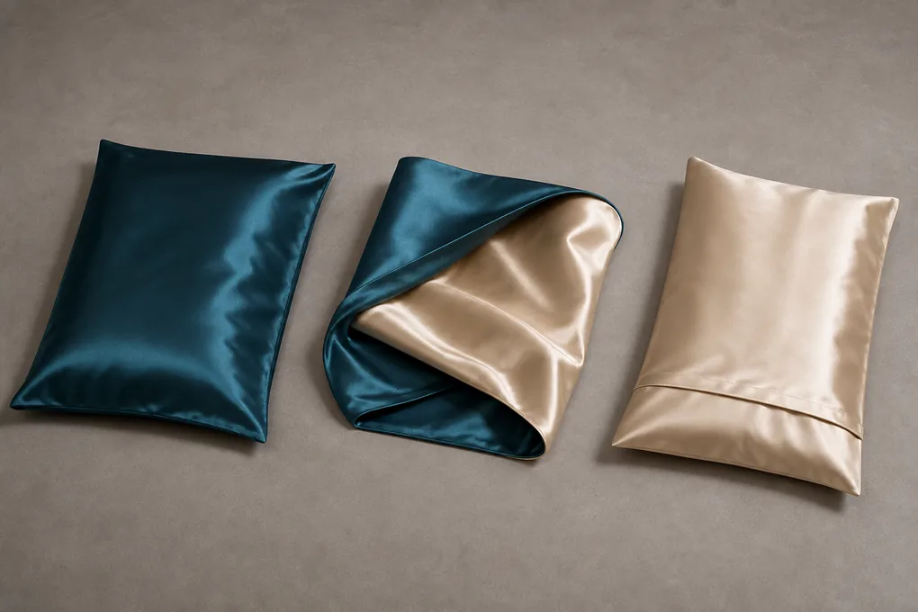
Engineer Edges, Corners, and Seams That Look Intentional From Either Side
A two-face pillowcase has no true back edge from the customer’s perspective. The perimeter, corner construction, and seam route must therefore be considered as visible design features as well as sewing details. A narrow turned edge can let two faces speak for themselves; a flange, piping, or contrast border can make the pairing more graphic. Each route changes the thickness, drape, measurement basis, and the way the case behaves when it is flipped. We help buyers choose an edge concept that supports the selected material pairing and retail message. The important review is on the filled, turned product—not on a short sample seam that never experiences the corners, opening, and bed presentation of a finished case.
Select an edge treatment that supports the face relationship
Turned edge, flange, piping, border, and selected visual line
The perimeter can frame or soften the contrast
The perimeter joins Face A and Face B into one retail article. A simple turned seam may suit a design led by colour contrast. A flange creates a relaxed decorative frame. Piping or contrast binding can distinguish the faces more clearly, but each needs a deliberate relationship to both surfaces. Buyers should decide what the edge must contribute to the collection: a crisp hospitality line, a framed gifting effect, a fashion colour break, or a quiet transition. That purpose gives material selection and sampling a specific visual target rather than an undefined luxury cue.
Specify the edge as part of the size and face drawing. Identify whether it is the same around every side, how it behaves near the opening, and which visual side is shown first in pack photography. If a secondary color is used, record it as a component rather than assuming it will follow the nearest face. The sample should be viewed flat, filled, and reversed so the buyer can judge whether the line remains consistent at the corners and whether the selected construction creates unwanted stiffness or bulk.
Review corners where two materials and an edge all meet
Corner turn, seam alignment, and filled-pillow appearance
Corner quality is visible long before a customer reads a specification
Corners concentrate several decisions in a small area. The fabric faces turn, the edge treatment changes direction, and the filled insert presses from inside. We recommend reviewing each corner after the case has been filled and positioned as it would be on a bed. Look for uneven turning, a visible mismatch between faces, a border that grows or narrows, or a corner that feels too firm compared with the body of the case. These observations should be described precisely in the sample notes so a revision addresses the actual location and construction relationship.
A buyer can also use corners to check orientation control. If the Face A print has a defined top edge, make sure it remains correctly placed relative to the opening and the corners. If the Face B material is a solid, confirm that the customer sees the intended contrast at each turn. It is better to define the visual outcome and review condition up front than to reject a sample later because different stakeholders were imagining different results.
Keep stitching expectations connected to a physical reference
Seam appearance, edge regularity, and face continuity
The approved sample is the useful quality reference
Quality language becomes more useful when it points to a visible product condition. For a two-face pillowcase, buyers may care about an even edge line, clean corners, balanced seam appearance, no unintended twisting, and a closure area that does not disrupt the preferred face. These are not universal claims that can be made from a website; they are review points to agree against the selected sample. A buyer should identify which details are critical for the channel and how they will be seen: on a white bed, in a premium box, in close e-commerce photography, or in a two-color display.
When an inspection requirement is needed, agree the measuring condition, reference sample, and action path in writing with the supplier. Avoid vague wording such as “perfect finish,” which leaves both sides guessing. A clear instruction might identify the edge section, the two-face alignment, and the observed issue that requires review. This respects the reality of textile sewing while giving purchasing a practical basis for supplier comparison and ongoing quality conversations.
Develop Color, Print, and Dye Approvals That Respect the Two-Face Construction
Color planning for a two-face silk pillowcase has to account for more than a flat swatch. Silk’s luster changes across folds, face direction, and room lighting; a printed panel can shift at an edge or opening; and a contrast selected for the front of pack may look different when both faces are folded together. We help buyers create a practical approval route that links a named color or artwork reference to the face it belongs to, the selected sample version, and the intended retail presentation. This keeps a vibrant reversible concept from becoming a collection of mismatched substitutes. It also gives creative and procurement teams a shared language for what is being approved and what still needs an on-product review.
Approve color as part of the assembled product
Physical reference, surface direction, and neighboring face
A silk tone needs to be viewed in context
A color chip or screen can begin a conversation, but the final buying decision should consider the color on the selected face, sewn into the intended construction, beside the alternate side. Light and surface direction can make a color look different on a filled case from the way it appeared on a flat textile. We encourage buyers to state which physical reference is controlling, which components must coordinate, and whether contrast is intended to be exact, tonal, or deliberately varied. That is especially useful for collections that pair a core solid with a printed or seasonal face.
Review the sample in the ways it will be sold and used. View it flat for color matching, folded for retail presentation, and filled for bedroom imagery. If a difference is observed, record which face, lighting condition, or product orientation produced it. That kind of feedback is actionable. A broad comment that a color feels wrong does not tell the next development round whether the issue lies in the primary face, the contrast face, the edge component, or the way the two surfaces interact.
Map prints to panels and opening direction
Artwork repeat, border position, and usable face orientation
Print files must anticipate a sewn article
Printed silk needs a panel-aware plan. A repeat may work well on Face A but move unexpectedly when the pillowcase is turned or when a border turns around the corner. A directional motif, logo-like element, stripe, or engineered placement should be shown in relation to the finished size, edge, and opening. Tell us whether centered placement is required, whether the design can vary across units, and which areas cannot carry a seam or closure interruption. This allows the buyer to assess the right finished sample rather than assuming a flat artwork proof answers every sewing question.
A two-face concept can also use print to help customers recognize the alternate side. If that is the goal, make the distinction deliberate in the colorway map and pack photography. Do not rely on a generic product name to convey which face has the print. The buyer should see the full case turned both ways before approving the retail image. That is the moment to catch an inverted motif, a border that stops awkwardly at the opening, or a Face B color that competes with rather than supports Face A.
Control artwork revisions across colorways and samples
Version names, approved references, and SKU linkage
Creative changes should not disconnect from construction
A simple version system prevents an artwork adjustment from being applied to the wrong face or size. Give each colorway a clear name, attach the Face A and Face B reference, note the print version, and keep it with the relevant sample comments. This is useful when a buyer presents several reversible ideas to a retailer or when a collection contains a seasonal color with the same basic construction. The sourcing conversation becomes more efficient because every requested change has a home: a face pairing, artwork file, edge color, or packaging panel.
During approval, separate what has been visually accepted from what still depends on a production-ready product review. A successful color or strike-off discussion may confirm a creative direction, while the assembled case still needs examination for placement, reversal, and pack folding. Clear version control stops a team from treating one positive result as approval for an entire range. It gives the buyer a controlled method for protecting licensed or proprietary artwork: share only through the authorized project route, state the scope, and connect it to the correct SKU.
Use a Two-Orientation Sample Review Before You Approve a Reversible Pillowcase
A reversible concept should be approved as a finished use object, not as two promising panels. We encourage B2B buyers to plan a review that checks the chosen article from both orientations: Face A outward, Face B outward, empty, filled, open, closed, flat, folded, and packed. The review can be concise, but it should name what the sample must prove. For a two-face silk pillowcase, that often includes material identity, face balance, edge appearance, closure handling, label placement, color or print orientation, finished fit, and selling-unit presentation. This turns feedback into an actual development decision instead of a collection of comments that cannot be carried into the next sample or quote.
Write the sample questions before the sample arrives
Use scenario, component decision, and review owner
The best feedback starts with a known question
A sample review is more useful when each stakeholder knows what they are evaluating. Merchandising may need to decide which face leads the collection; a product manager may need to choose an edge; quality may need to observe corner construction or label exposure; packaging may need to confirm the fold. List those questions in advance, together with the named sample version and the intended insert or presentation condition. This avoids a common B2B problem: several people approve different aspects of different samples, then assume one composite product is ready for bulk discussion.
Include the buyer’s actual use context. A hospitality program may focus on a consistent bed appearance across multiple rooms, while a retail gift set may focus on the first-open moment and visible face pairing. A digital brand may need a clean two-face e-commerce view. Each scenario should remain tied to one selected configuration. Do not ask a sample to prove an undefined promise; ask it to answer a product decision that will be carried into the documentation and quotation.
Inspect the case in both customer orientations
Fill, flip, close, fold, and photograph the selected version
The reverse must survive normal handling
We recommend a physical sequence during review. First inspect Face A, then fill the case with the nominated insert and check the opening, edge, and visual balance. Turn the same case to Face B, repeat the handling, and compare what changes. Fold the article as it will be presented, examine the pack cue, and take the views that sales or retail partners need. This exposes issues that are invisible when the case is treated only as a flat textile sample: a closure that appears on the wrong face, a label that becomes prominent, an edge that twists, or a print that loses direction.
The reviewer should note both the observation and the required action. For example, retain the selected Face A and Face B colors but move a label, revise a border, or confirm a different closure route. Avoid comments such as “make it better,” which do not tell the next team what changed. A direct observation tied to the face, location, and use condition is far easier to carry into a product revision and a future quality conversation.
Close the review with clear acceptance boundaries
Accepted configuration, revision list, and excluded variants
One sample does not automatically approve every SKU
At the end of review, identify the exact product version that was examined and the status of each decision. Note what is accepted, what must be revised, what is waiting for buyer input, and what belongs to another variant or future collection. If a face pairing is approved for one size but not another, record that limitation. If a printed colorway still needs a placement check, do not let a successful solid sample create a false sense of completion. This discipline keeps commercial discussion honest and avoids bulk assumptions that no one actually approved.
The same acceptance note can guide packaging and copy. It tells the team which face labels, images, material statements, and care direction belong to the selected article. If changes are made after the sample, link them to the approved reference rather than copying text forward. Clear boundaries are not an obstacle to moving a project ahead; they are how a buyer keeps a reversible product’s many visible decisions from becoming detached from each other.

Create Labels and Care Information That Stay Accurate When the Case Is Flipped
A reversible pillowcase can make ordinary labeling choices surprisingly visible. The customer may see the label from either side, read a material phrase as applying to the whole article, or encounter a care instruction after turning the case to a different face. We help buyers plan labels, care communication, and retail product data around the specific selected configuration. That means deciding where the label sits, what it names, which component or whole-product wording is justified, and the information path a customer uses without having a secondary face dominated by a tag or seam. Accurate information improves the purchase experience and gives the brand a cleaner basis for retailer data, customer support, and future replenishment.
Place labels where they do not defeat the second-face experience
Side seam, opening area, internal attachment, and chosen visibility
Information needs a planned physical location
A label placement decision should be made with the case turned both ways. A side seam position may be discreet in one orientation and prominent in another. An opening location may be easy to find without sitting on the primary visual face. The selected solution depends on the closure, edge, face materials, and retail concept. We ask buyers to specify the required label types—brand, care, fiber, size, compliance, or internal traceability—and then review their placement on an assembled sample. This is more reliable than approving a label artwork file without seeing how it behaves on the finished product.
Consider the customer’s handling path as well. The customer should be able to find useful care or material information without having to guess which face is the inside. If a label is intentionally concealed, the pack or insert may need a concise information route. Keep the explanation proportionate to the selected product; no label should make a claim broader than the face or component it actually describes. Align the label language with the retailer listing so customers receive the same basic information wherever they encounter the item.
Write component-specific material statements
Face scope, whole-product scope, and supporting components
Precision prevents a two-face story from becoming misleading
Material language should follow the component map agreed for the product. When a statement applies to both faces, the selected construction should support that wording. When it applies to one face, a lining, trim, or an alternate component, the label and product data need a clear scope. This does not require long technical prose on a consumer package. It requires the buyer to avoid a phrase that invites a customer to assume every part of a mixed construction is identical. The source of truth should be the final product specification, not a catalog phrase or a marketing draft.
We recommend a cross-check before release: compare the face map, material statement, care label, packaging copy, e-commerce bullets, and the actual sample. Look for terms that have drifted from a selected face to the entire article or from one colorway to a group of variants. This small review is particularly valuable for private-label projects, where creative, sourcing, and compliance responsibilities may sit with different people. A shared product reference keeps the final information useful and consistent.
Connect care direction to the selected article and market
Care label, pack insert, and customer support route
Useful guidance is configuration-specific
Care communication should reflect the selected materials, construction, and destination-market requirements that the buyer and supplier have agreed. Do not copy a care phrase from another pillowcase simply because both items include silk. A two-face construction may have a different component combination, closure, edge, or color treatment that needs its own review. The buyer can state what documentation, testing, or care-label support is required in the inquiry, and the final direction should be confirmed through the appropriate commercial and compliance process.
From a product-experience perspective, keep the customer journey simple. If care instructions are on a sewn-in label, make sure they remain accessible after the case is flipped. If an insert carries more detailed direction, ensure it matches the selected item and is included in the agreed pack. The goal is not to burden the product with disclaimers; it is to give a customer clear, honest help that corresponds to the reversible pillowcase she actually bought.
Design a Selling Unit That Shows the Two-Face Value Without Creating Pack Confusion
A reversible pillowcase reaches the customer as a selling unit, not as a folded fabric swatch. The pack has to protect the selected construction, identify the correct colorway and size, and reveal enough of the Face A–Face B relationship to make the product choice understandable. A tuck, pouch, sleeve, card, box, or gift-set format changes what the customer sees first. We help buyers plan the fold and information hierarchy around the actual item. This is especially important when both faces carry visual value: a pack that shows only one solid side may hide the reason for a higher-value two-face concept, while a pack that exposes too much can leave the pillowcase creased, misidentified, or difficult to replenish accurately.
Choose a fold that respects the selected faces and edge
First-open view, protected surfaces, and visual contrast
The retail presentation should match the product promise
Begin with the product view that needs to greet the customer. Some programs benefit from a fold that reveals both faces at once; others need Face A visible through a clean opening while Face B is explained with a small image or swatch. Check how the selected edge, closure, and any directional print sit in the pack. An elegant fold on a plain case may conceal a border or place a logo-like motif upside down on a reversible design. Prototype the pack with the actual sample before approving artwork based on an empty box or generic pillowcase.
Protection also matters. Silk surfaces, contrast colors, and folds should be considered together with the intended carton or shelf format. We do not make transport claims without an agreed test and shipping context, but buyers can still review practical risks such as visible crease placement, hardware contact, or a label that rubs against the wrong face. The chosen fold should make it easy for operations to identify the exact colorway and for retail staff to display it in the intended orientation.
Make the colorway and size legible through the pack
Face pairing, SKU cue, barcode, and retail naming
A two-face item needs more than a single-color label
A reversible pillowcase can be mis-picked when the primary face is the same across several variants but the reverse changes. Build a pack identity that follows the full configuration: Face A, Face B, size, edge option where relevant, and selling-unit count. The customer-facing name can stay elegant and concise, while internal and barcode information identifies the complete product. Compare all variants side by side before release. If two packs look interchangeable yet contain different reverses, revise the cue before the product reaches fulfillment.
This planning is helpful for multi-channel buyers. A department store, a direct-to-consumer site, and a gift program may each need a different visual entry point, yet every channel must retain one configuration identity. Keep the pack artwork, product data, photo filename, and purchase row linked. That prevents a customer from ordering a colorway from one photograph and receiving the corresponding primary face with an unexpected reverse. Clear identity is part of the quality of a reversible product experience.
Treat sets as complete configurations, not loose pairings
Pillowcase count, companion items, and opening sequence
A gift set needs its own product review
When a reversible pillowcase is sold with a sleep mask, scrunchie, duvet cover, or another bedding item, the set needs an independent count and presentation plan. Decide whether the two-face pattern is repeated, coordinated, or intentionally contrasted across components. Map every included item, its colorway, and how it is protected or displayed. A pillowcase approved as a single unit does not automatically produce a coherent set. The assembled set should be reviewed for visual hierarchy, component count, labels, and the opening experience the customer will receive.
The package also has to support operations. A set with two pillowcases may need a way to identify matching Face B colorways without opening the box. An insert can explain the styling idea, but it should not compensate for a confusing item map. Include the set structure in the RFQ and sample review so procurement can receive a comparable response and marketing can speak about an actual, assembled selling unit rather than a collection of related photographs.
Prepare a Quote-Ready Two-Face Pillowcase Brief With Quality Questions That Matter
A productive B2B inquiry does not need every answer finalized, but it does need to make open questions visible. For a two-face silk pillowcase, the brief should bring together intended customer use, Face A and Face B directions, finished size and insert relationship, opening and edge choice, color or artwork references, packaging direction, commercial quantity context, sales destination, and the sample decision still blocking approval. We help buyers organize these inputs so suppliers are responding to the same article. That makes commercial comparisons more meaningful and keeps the early conversation focused on real product choices instead of a generic request for a price. Unknown MOQ, timing, cost, documentation, and testing requirements should be discussed and confirmed through the appropriate project conversation rather than guessed from a public page.
Separate confirmed selections from questions needing advice
Fixed product choices, alternatives, and approval gaps
An honest RFQ moves faster than a falsely complete one
Start the inquiry with what is known: the intended range, Face A and Face B concept, proposed material direction, size rows, preferred opening or edge, colors or authorized artwork, pack format, and quantities by configuration. Then list the questions that are not yet resolved. A buyer might know the primary face and still need guidance on a closure; another might have approved a print but be deciding whether Face B should be a solid or tonal pattern. Naming those questions gives the supplier a focused basis for response and prevents alternatives from being hidden inside a single ambiguous request.
Attach reference images with a note about what they are meant to show. A photo may illustrate a border, an opening style, a face relationship, or a folded retail view; it should not silently define every unseen component. If proprietary artwork is involved, use the authorized sharing route and state which SKU it belongs to. This approach gives the product team a clear conversation without treating a website or public image as proof of a final production specification.
Set product-specific sample and quality review points
Identity, face alignment, fit, closure, edge, labels, and pack
Review what the customer will actually notice
The quality questions for a two-face product should follow the selected configuration. They may include correct Face A and Face B pairing, color or print orientation, finished size against the named reference, closure operation, edge consistency, corner appearance, label placement, and selling-unit completeness. If a measurement method, tolerance, inspection level, or test requirement is needed, the parties should document it for the exact product and market. A public description cannot replace an agreed quality plan, but it can help the buyer name the physical features that deserve attention.
Use the approved sample as the relevant visual reference once it exists. Mark which features are accepted and which remain open for the next revision. Keep a solid colorway distinct from a printed or mixed-material option until each has received the appropriate review. This keeps quality expectations close to the product customers see and prevents a broad statement about “reversible quality” from hiding a specific face, edge, or closure decision.
Give purchasing a complete configuration row for comparison
SKU, variant quantities, destination, packaging, and decision timing
Better inputs create a more useful supplier conversation
For each configuration, provide a simple row: product name, Face A direction, Face B direction, size, opening, edge, color or artwork version, labels, pack, quantity, destination, and requested sample or commercial decision. This makes it possible to compare supplier responses without losing the two-face variables that affect the article. It also supports internal budgeting and assortment review because the buyer can see which selections are shared across variants and which introduce a separate development question.
Close the brief by naming the immediate priority. Is the obstacle face balance, component wording, closure handling, a defined retail pack, or a multi-size assortment? This tells us where to begin the conversation so your next product decision can move forward. We do not assign production commitments, certification scope, lead times, prices, or performance outcomes from a public inquiry. Instead, we use the details you supply to discuss the reversible pillowcase configuration you want to develop.

Two-Face Pillowcase Buying Questions
What should a buyer specify for a reversible silk pillowcase?
Identify both visible panels separately, then include finished dimensions, insert reference, opening route, edge detail, colour or artwork, labels, pack, quantities, destination, and the unresolved sample question.
Does two-face mean both sides can use the same material wording?
Only when the selected construction supports that statement. Mixed constructions and component details should be described with the relevant scope in the final product and labeling review.
What should we review on a two-face pillowcase sample?
Inspect both orientations on the intended insert, including face balance, edge and corners, closure handling, labels, print direction, finished fit, and the packed selling-unit view.