
P010
Printed Silk Pillowcase Artwork Development
We help B2B buyers turn approved artwork into a printed silk pillowcase brief that a product, sourcing, quality, and packaging team can use without guessing. A polished flat file is only the beginning. The finished pillowcase must preserve the intended motif through panel cutting, seam allowance, opening construction, edge treatment, folding, and the real visual conditions in which a retailer presents it. Bring us the artwork status, selling format, proposed variants, destination, and the immediate decision your team needs to make; we will organize the questions that belong to the finished product rather than offering a vague print promise.
Published by China EverBen Silks Reviewed by Mark Liu
Avoid approving print direction without a surface and repeat map
Identify the printable face, artwork authority, repeat, seam, color reference, and pack context.
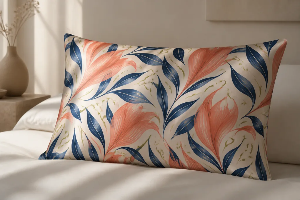
Establish Artwork Ownership and a Production-Ready File Handoff
A printed silk pillowcase program goes wrong before sampling when the team treats an attractive design file as a complete manufacturing instruction. We start by separating legal permission, creative intent, and production data. Your purchasing team needs to know who can authorize the artwork, which file is current, what may be altered for scale or technical setup, and which visual details are non-negotiable. That record prevents a stale export, unlicensed element, missing linked image, or unmarked color revision from becoming the version used for a finished product review.
Name the Artwork Owner, Approval Authority, and Controlled File Version
Record the person or business entity that may release the design for this product program
Prevent an unapproved or superseded file from entering the sample brief
We ask for an artwork register rather than an informal folder link. The register can be short, but it should identify the program name, SKU family, file name, issue date, revision code, artwork owner, and the person authorized to approve changes. If a licensing agency, brand studio, retailer, or outside designer is involved, state who may confirm the final visual rather than assuming that the person sending the file has that authority. A buyer also needs a plain statement about whether motif scaling, recoloring, cropping, mirror placement, or removal of a detail is permitted. Those choices can be technically useful, yet they are creative changes when they alter the intended appearance. We keep the artwork version connected to the pillowcase brief so a production question can be returned to a named decision maker instead of being settled through a verbal recollection after the sample is sewn.
Provide the Design Elements Needed to Inspect a Print Before Sewing
Provide linked artwork, fonts, color references, and a viewable proof in addition to the working file
Avoid missing objects, substituted fonts, and untraceable color intent
The working file alone is not always readable by every reviewer. We recommend handing over the editable artwork where available, a locked reference PDF or image for visual comparison, any linked graphics, font information or outlined type, and a clear note identifying embedded versus separate elements. When a color reference matters, identify what it is: a physical swatch, a previous approved product, a brand guide, a digital value, or a visual direction still awaiting physical confirmation. Do not allow a mood image to masquerade as a final target. The best handoff also shows the full repeat or placement field, not only a cropped beauty image. This gives your product manager, quality reviewer, and packaging team a shared object to discuss. It also makes it easier to recognize whether a later proof reflects the approved composition or merely resembles it.
Create a Change Path That Protects Both the Buyer and the Design
Use dated comments and a decision log when artwork changes after the first technical review
Keep commercial urgency from erasing an earlier visual decision
Printed products frequently change in small ways: a motif is enlarged, a border moves, a background is lightened, or a label panel is added after the first review. None of those changes should disappear inside an email thread. We encourage a concise change log that states what moved, why it moved, which SKU is affected, and whether the buyer needs another physical review. A revision that only alters a carton label may not need the same review as one that changes the printed face or the relationship of a motif to an opening. This distinction saves time without weakening control. For a wholesale buyer, the value is practical: merchandise planning can keep variant names and imagery aligned while purchasing can ask for a quote against one current configuration. We do not treat a generic approval message as permission to reinterpret the design later.
Choose Repeat, Placement, and Orientation for the Finished Pillow Form
The same artwork can behave like three different products when it is engineered as an all-over repeat, a centered placement, or a directional hero panel. We help you decide which route fits the retail story before the layout is committed. The relevant question is not simply whether the print looks good on screen. Ask how the artwork reads after the pillowcase is filled, how a customer sees it on a shelf or bed, whether the front and back must coordinate, and how much variation the range can accept from one cut panel to another.
Decide Whether the Design Needs an Endless Repeat or a Controlled Focal Area
Match the artwork architecture to the visual job of the intended SKU
Avoid a hero motif that disappears into cutting variation or a repeat that feels accidental
An all-over repeat can be useful when your collection needs visual movement without one fixed front-facing scene. A placement design can be more suitable when a logo, illustration, border, or featured motif must sit in a deliberate location. We ask you to state which outcome matters more: continuity across the item, a recognizable front panel, or a balanced pair of surfaces. That choice influences the artwork field, the likely cut relationship, and the way the finished product should be photographed and packed. If the program includes paired pillowcases, decide whether both units are expected to look identical, coordinated, or intentionally varied. Buyers sometimes approve a digital repeat without noticing that a large focal object may land differently on each finished unit. We put that risk into the initial discussion so the range does not depend on an unspoken expectation of identical motif placement.
Set Directional Rules for Top, Bottom, Front, Back, and Opening Side
Describe the orientation a reviewer should see when the pillowcase is laid flat and when it is in use
Stop upside-down artwork and mismatched panels from reaching pack review
A directional print needs more than an arrow on a digital proof. We recommend a simple orientation map that labels the display face, reverse face, top edge, opening side, and any designated left or right panel. If the item may be turned or folded in more than one way, identify the customer-facing view that controls acceptance. This is especially important for text, characters, florals with a clear stem direction, stripes, borders, and artwork that is meant to frame a pillow. The map should also tell us whether the reverse is a continuation, a mirrored version, or a separate design. Your quality team then has a practical reference for review instead of relying on memory. We can discuss alternate layout choices, but we will not convert a directional artwork into a non-directional product without written direction from the authorized reviewer.
Plan Motif Scale Against the Real Finished Dimensions
Review the size of key objects after allowing for seams, edge finish, and filled-pillow shape
Keep a small motif from becoming visual noise or a large motif from losing its intended composition
Motif scale should be judged against the finished object, not only against the artboard. A dense mini print may look refined on a monitor yet merge visually at retail distance. A large scene can look dramatic in a flat layout but lose its center when the panel wraps around a filled pillow or when an opening removes part of the image. We ask for a view that shows the expected finished dimensions with safe areas, likely seam allowance, and the intended front-facing section. Where a design includes recognizable objects, note whether cutting through them is acceptable. Where it includes a border, note the minimum visual clearance from the finished edge. These decisions are commercial as well as visual; a merchandising team needs predictable imagery for a product listing, and a quality reviewer needs an unambiguous reference when evaluating a sewn sample.
Map Artwork to Cut Panels Before the Pillowcase Is Sampled
A print can be approved as artwork and still fail as a pillowcase because the design was never mapped to actual cut panels. We build the placement conversation around the physical components: display face, reverse face, opening area, any flange or border, label zone, and the areas affected by seam allowance. This is where a buyer can prevent a critical motif from falling into an opening, a seam, or an edge treatment that makes the artwork hard to read.
Draw a Panel Map That Links Artwork Zones to Each Component
Show which part of the design belongs on the display face, reverse, opening, and edge areas
Make the finished configuration visible before anyone judges a strike-off as a product
We recommend a panel map that a non-designer can understand at a glance. It does not need to be a complex engineering drawing; it needs named pieces and visible boundaries. Mark the intended display face, reverse panel, opening region, edge detail, and any non-printed component. Then overlay the artwork or reference the repeat direction so the reviewer can see where the important visual elements may appear. This map makes a hidden decision explicit: whether the artwork should continue through construction transitions or stop before them. It also distinguishes a product detail from a styling image. A product buyer can use the map to compare proposed variants, while a quality reviewer can use it to evaluate whether the sample follows the approved route. Without it, a supplier may receive a complete-looking file but lack the information needed to connect it to a sewn item.
Reserve Safe Areas for Logos, Borders, and Recognizable Motifs
Identify visual elements that must remain clear of seams, folds, openings, and label attachment points
Protect the parts of the design a retailer expects a customer to recognize immediately
Not every area of a print carries equal importance. A brand mark, character face, signature border, or central illustration may need a protected zone. We ask you to identify those elements directly rather than describing the artwork as generally important. The instruction should explain whether the element must be fully visible, centered within an approximate viewing field, or simply kept away from a construction interruption. If partial appearance is acceptable, say so. If it is not, show the no-cut zone in the placement file. This gives the sample review a meaningful standard. It also prevents a common conflict in which a technically plausible panel layout is rejected because the buyer assumed a recognizable motif would always land in the same place. We do not promise exact repeat placement unless the approved construction and artwork plan define that requirement and its review method.
Use the Sewn Prototype to Test What the Flat Map Cannot Show
Check the approved layout on the item after filling, handling, folding, and viewing it from normal retail angles
Confirm that the mapped artwork survives the transformation from panel to sellable unit
A physical prototype reveals effects that a panel map can only anticipate. We ask the buyer to look at the filled pillowcase, not just the empty cover, because the surface changes when the product takes shape. Review the visual center, any cut-through motif, the readability of a border, the way the opening changes the reverse face, and the artwork seen after the item is folded for its proposed pack. Photograph the agreed views for the approval record, including details that a future inspector can locate. If the sample identifies an issue, describe the correction in terms of the product: move the placement field, adjust the scale, change the panel relationship, or revise the opening position. That gives the buyer a defined correction to evaluate instead of an imprecise request to improve the artwork. It turns a subjective reaction into a controlled next action.
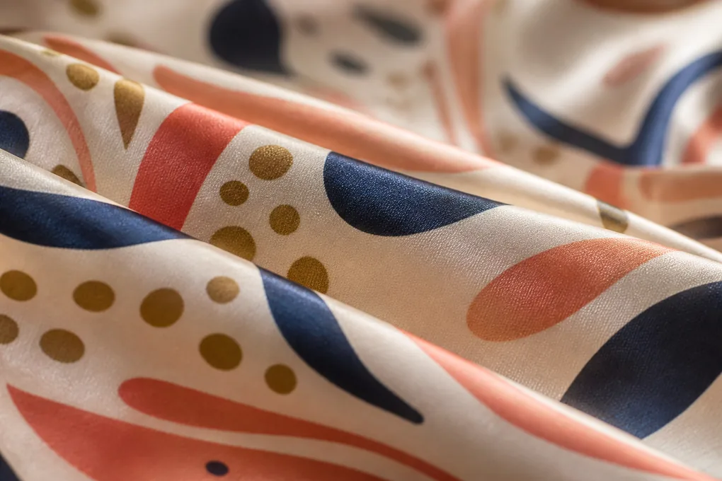
Coordinate the Opening, Seam Allowance, and Edge Detail with the Print
The pillowcase opening and edge treatment change the artwork more than many product briefs acknowledge. An envelope closure, zipper opening, flange, piping, narrow hem, or other edge construction creates interruption points that need to be considered before the first sample. We keep construction and print in the same decision rather than approving a visual layout on one day and introducing the opening detail later. Your buyer should be able to explain where the print may stop, overlap, turn, or remain deliberately quiet.
Place the Opening Where It Supports the Intended Display Face
Choose an opening relationship that does not compete with the primary artwork view
Prevent the closure area from becoming an unplanned focal point
The opening is a functional feature, but it also occupies visual territory. We ask where a retailer or customer is expected to see it: behind the pillow, at one end, along a side, or within a reverse panel. That answer informs the print plan. A design with a defined front image may need the opening kept away from the primary view, while an all-over repeat may tolerate a more flexible relationship. Where an envelope fold or other overlap is involved, show which printed areas may be hidden when the pillowcase is used. If the opening has hardware or an attached pull, identify whether it should blend into the design, contrast intentionally, or remain visually secondary. We avoid treating this as a generic construction note because the correct answer depends on the specific artwork, presentation method, and product identity you are building.
Allow for Sewing Space Without Sacrificing the Planned Composition
Mark the artwork zones that may be affected by seam allowance, turning, and edge finishing
Avoid approval of a visual that cannot remain intact after assembly
Seam allowance and edge finishing are not optional white space; they are part of the transformation from printed panel to finished product. When artwork sits close to an edge, specify whether a slight crop is acceptable or whether the design must maintain a visible margin. A border needs particular attention because a narrow difference can make it appear uneven even when the sewing itself is sound. We recommend marking the critical visual boundary rather than trying to prescribe undocumented production tolerances. The important point is to identify what the buyer will evaluate: a continuous border, a clear gap, a centered frame, or a repeat that can end naturally. This lets the team review the correct thing at sample stage. It also helps the buyer determine whether the planned edge treatment serves this artwork or whether a simpler solution would preserve the visual more reliably.
Separate Decorative Edge Choices from Product Claims
Describe the visible construction result without implying performance or certification that has not been verified
Keep the product page useful for procurement and safe for retail communication
A flange, piping line, contrast edge, or simple finished border can be commercially meaningful because it changes the visual category of the pillowcase. We describe those options as visible construction decisions, not as proof of durability, comfort, health benefit, or premium status. If a buyer wants to use a specific retail claim, submit the proposed wording for review against the exact material, construction, and support available for that SKU. The same discipline applies to care language and certification references. We can organize a claims review, but we do not fill the page with broad assurances that the brief cannot substantiate. This protects a home-textile buyer who must pass product information through internal legal, marketplace, or retailer processes. It also keeps the product conversation focused on what can be examined directly: the artwork, panel layout, closure, finish, and finished presentation.
Define Material and Panel Scope Without Blurring the Product Specification
Printed silk pillowcase conversations often become unhelpful when the material is described with vague luxury language instead of a clear product scope. Our buyer brief begins by naming the selected base-material reference, whether both faces follow the same construction route, which components are printed, and which details are outside the print decision. This does not require inventing a universal material statement. It gives your team a clear method for connecting artwork development to the product configuration that will actually be quoted and sampled.
Identify Which Components Carry the Approved Printed Silk Artwork
State whether the display face, reverse face, gusset, flange, or other component belongs in the artwork scope
Stop a partial print plan from being misunderstood as a complete product specification
We begin by naming the component that carries the artwork. A printed display face with a coordinated reverse is a different product decision from an item where both faces use the same artwork field. A border, flange, or piping detail may be printed, unprinted, contrasting, or not included at all. Your brief should make that distinction visible. It should also separate material identity from artwork placement; saying that a pillowcase is silk does not tell a reviewer whether the reverse panel, edge treatment, or label area follows the same selected construction. We use the approved material reference provided for the program rather than inserting an unsupported fiber, weight, certification, or performance statement. That approach gives purchasing a comparable basis for quotation and avoids the later problem of discovering that the sample represented only one surface while the commercial request assumed a different finished configuration.
Keep Surface Appearance, Hand, and Print Intent in One Review
Evaluate the artwork together with the selected material reference instead of approving it in isolation
Make sure the visual decision reflects the product buyers plan to sell
A printed visual cannot be evaluated completely apart from the surface on which it appears. We ask for the selected material reference, a note about any panel difference, and the visual attributes that matter to the product team, such as a refined sheen, a soft drape, a crisp graphic field, or a muted presentation. Those are creative directions, not performance guarantees. During sample review, compare the print to the approved visual reference under the agreed viewing conditions and note whether the artwork still communicates the intended range identity. If the buyer is deciding between two product configurations, keep them as separate options with their own panel and artwork descriptions. Combining them under one general phrase creates ambiguity for merchandise imagery, quality assessment, and pack copy. We support a documented choice; we do not convert a preference into an unqualified material claim.
Hold Unconfirmed Technical Values Open Until the Product Brief Supports Them
Use named references and agreed sample observations rather than assumed performance figures
Prevent unsupported commercial language from entering a product listing or supplier comparison
When a brief lacks a confirmed fiber composition, weight, testing method, certification scope, or care result, we mark that point as a question rather than completing it with a familiar market phrase. This is not a limitation of the product discussion; it is how a buyer keeps decisions traceable. You can still define the visual and construction work needed to progress: which panel is printed, where the artwork sits, what sample configuration should be reviewed, and what retail information must be approved later. If the missing value is commercially important, include it in the inquiry as a specific request with the intended market and use context. The resulting review can then distinguish a supplier-provided document, a buyer requirement, and a claim that should not appear until evidence exists. This discipline reduces rework when procurement, quality, and marketing read the same product page.
Set Ground-Color and Printed-Color Approval Stages
A color name does not create a meaningful approval standard for a printed silk pillowcase. We help buyers separate the ground appearance, individual printed colors, the expected effect of surface sheen, and the visual relationship among variants. That separation matters because a digital visual, a brand palette, a prior product, and a physical sample can each be useful for different reasons. The brief should tell the reviewer what comparison is being made, under which conditions, and what must be approved before the program moves forward. A disciplined color discussion also prevents merchandising photographs, product listings, sample comments, and packaging proofs from using the same color name while referring to different visual targets. Give each reviewer the relevant reference and decision boundary instead of asking them to judge an undefined idea of correct color.
Distinguish a Color Direction from a Physical Color Reference
Label every reference as a visual intention, digital value, physical swatch, or prior approved item
Avoid treating a mood image as if it were a final color standard
We ask buyers to classify each color input before it reaches sample review. A mood board can communicate a collection direction; a brand guide can identify a protected color family; a physical swatch can support a closer visual comparison; and a prior approved item can illustrate a target relationship. They are not interchangeable. Marking the source of each reference helps your team decide what the sample must demonstrate. If an exact visual match is required, provide the relevant physical or controlled reference and explain which part of the product it applies to. If the request is a range impression, say that plainly. This prevents a supplier from over-reading a digital file and prevents a buyer from rejecting a sample against a reference that was never intended to be exact. The result is a more honest approval conversation for a printed textile product.
Review Ground and Artwork Colors as Separate but Related Decisions
Check the background field, key motifs, secondary accents, and any coordinating trim in a defined order
Find the color change that affects range identity before it reaches a retail photo or pack proof
The background field can change the reading of every printed element above it, so we do not collapse the review into one statement that the colors look right. Start with the ground appearance, then examine the major motif colors, smaller accents, and any component intended to coordinate with the print. Identify which differences are commercially important: a brand signature tone, a face or logo, a border, or the contrast between variants. If the range contains several colorways, place them side by side in the intended product family so the buyer can judge separation and coherence. Keep the record product-specific. A color decision for one artwork field does not automatically approve another artwork, size, or packaging treatment. This protects the retailer-facing assortment from accidental duplication or a mismatch that only becomes obvious when the units are displayed together.
Use Physical Review Stages Before Treating Color as Released
Move from file review to relevant physical evidence with a clear decision recorded at each stage
Make late-stage color objections easier to identify and resolve
We recommend a staged color review: first confirm the current artwork and intended palette, then examine the relevant physical representation, then inspect the sewn product in the configuration your buyer plans to sell. At each point, record whether the decision is artwork-only, material-and-print, finished-product, or packaging-related. A sewn pillowcase may expose visual effects that a flat print cannot, especially around seams, folds, or a filled surface. The review should also state whether a result applies to every named variant or only to the exact sample shown. If a change is required, give a direct instruction such as revise the background direction, adjust the motif relationship, or submit a new physical review for a named colorway. This gives the team a clear next action instead of an unspecific remark about the shade.
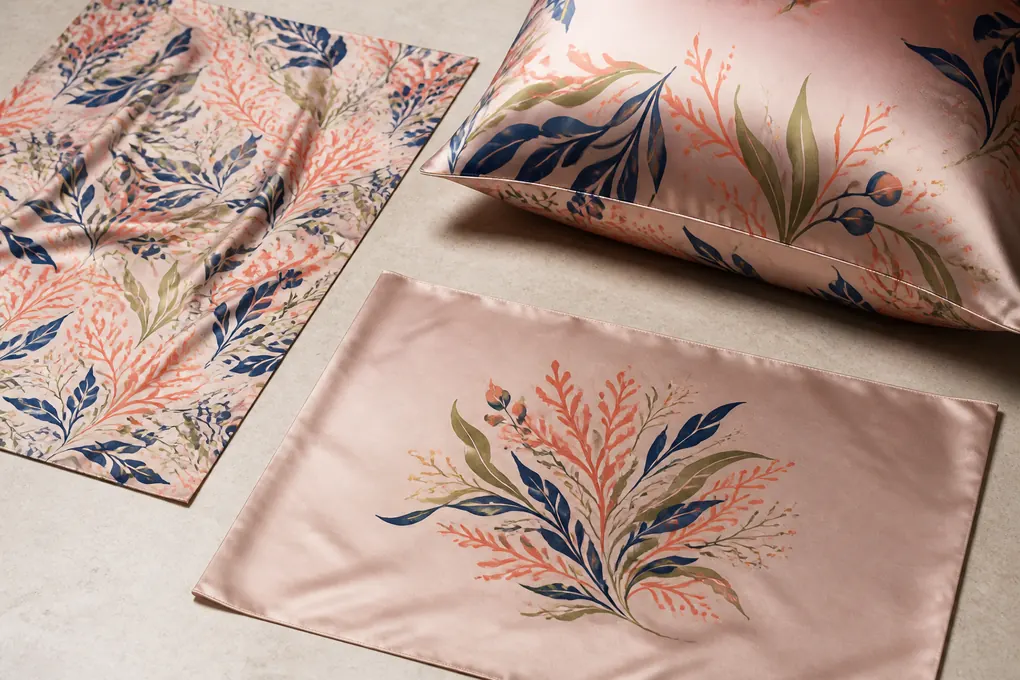
Plan Colorways, Variant Names, and Assortment Comparison
A printed pillowcase range needs more than several attractive colorways. Purchasing, e-commerce, retail operations, and quality teams need a stable way to distinguish each variant from the point at which artwork is reviewed through the point at which a carton is received. We help buyers create an assortment record that ties a meaningful variant name to its artwork revision, panel plan, packaging identity, and current approval status. This makes range comparison practical without turning the page into an unsupported inventory promise.
Give Every Proposed Colorway a Business-Usable Identity
Pair a clear variant name with artwork version, intended visual role, and pack identifier
Keep sales, sourcing, and quality teams from using different names for the same product
A good variant name is short enough for a product system but specific enough to prevent confusion. We suggest pairing the commercial name with an internal artwork revision or product reference in the working brief. Add a one-line visual role if the range includes a hero colorway, an evergreen neutral, a seasonal print, or a coordinated set member. This is not marketing copy; it is a working identity that helps a buyer compare the right items. The packaging artwork, barcode assignment, and retailer listing can then be connected to that identity once those elements are approved. Avoid naming two visibly close variants with terms that your operations team cannot distinguish on a sample table. If a colorway is still exploratory, label it as such rather than allowing it to appear as a released SKU. That clarity reduces accidental duplication in sample requests and quote comparisons.
Compare Variant Families on the Same Finished Product View
Review colorways side by side using matching product orientation and presentation conditions
Reveal assortment overlap and visual imbalance before listings and packaging are finalized
Colorway comparison is most useful when each item is shown in the same finished condition. A flat artwork tile beside a filled pillowcase photo does not tell a buyer whether the range will separate on shelf. We encourage a comparison board that uses matching views, the same named display face, and a clear note of any construction difference. Look for motifs that lose distinction at the relevant retail distance, colors that merge under ordinary light, and variants whose label or pack direction makes them hard to identify. The goal is not to force every item to look different; it is to know whether each one serves a deliberate commercial role. If a buyer wants a coordinated family, record the shared visual rules. If the buyer wants contrast, record the features that must stay distinct. That makes assortment review a concrete decision rather than a general design conversation.
Link Each Variant to Its Own Sample and Quote Questions
Record whether changes in artwork, placement, construction, or packaging require separate review
Do not let approval of one sample silently stand in for a different commercial configuration
A collection can share a base concept while still requiring different review questions for individual variants. One colorway may use a larger placement, another may have a different ground direction, and a third may require distinct pack artwork. We ask buyers to list those differences next to the variant name before requesting a quotation or sample. The list does not need to predict every commercial value; it should show what makes the item a different decision. This lets our discussion stay focused on comparable product routes. It also helps your internal buyer decide whether a sample has answered the exact question assigned to it. If a new colorway is added after the first prototype, treat it as a named extension with its own artwork and review status. That is safer than describing the range as approved and assuming all later variations inherit the same conclusion.
Build a Quote-Ready Artwork and Product Matrix
A comparable B2B quotation needs a matrix, not a collage of artwork files and product photos. We help you turn the program into a buyer-readable list of decision fields: proposed variant, artwork revision, print layout, selected product route, opening and edge direction, pack requirement, destination, and unresolved question. The matrix is not a price list and does not invent a MOQ, timeline, capacity, or material claim. It is the structure that allows a purchasing team to ask for a like-for-like review. It also gives an internal buyer a clean way to identify which information must come from design, packaging, sourcing, retail operations, or the destination-market owner before a request can be completed.
List the Product Fields That Change the Printed Pillowcase You Are Buying
Use one row per commercial configuration instead of hiding differences inside an artwork name
Make supplier comparison possible before sample and commercial terms are discussed
For each proposed configuration, identify the pillowcase style, finished size direction, printed components, artwork revision, repeat or placement type, opening concept, edge treatment, label requirement, packaging direction, and intended destination. Add the quantity and unit only when your organization is ready to provide them; do not invent commercial values to make the sheet look complete. The point is to show which rows are genuinely comparable and which need a separate conversation. A buyer can then see whether a quotation request refers to one display-face print, a two-panel print, a special placement, or a range with different packs. We find that a simple matrix exposes missing questions early. If a row does not state whether the artwork is final or exploratory, for example, the next sample decision is not yet clear.
Separate Confirmed Inputs from Buyer Decisions Still in Progress
Mark each field as approved, proposed, supplied for review, or awaiting buyer direction
Keep an estimate from being mistaken for a released production instruction
A procurement matrix becomes more useful when it makes uncertainty visible. We recommend a status column that distinguishes an approved input from a proposal, a buyer-supplied reference, and a point that needs a decision. This protects everyone involved in the process. Artwork may be approved while pack copy remains open; an opening style may be selected while the exact label placement awaits a retailer guide. Those conditions do not stop a technical discussion, but they should not be disguised as final. We use the matrix to focus our questions on the fields that change the product most materially. A clear open item is easier to resolve than a silent assumption found after a sample arrives. It also helps a buyer brief colleagues who were not present during the initial artwork conversation.
State the Comparison Goal Before Requesting Commercial Review
Explain whether you need an artwork feasibility discussion, a sample plan, a variant comparison, or a quote-ready configuration
Direct the inquiry to the business decision that is actually blocking progress
Different buyers need different answers at the same stage. A product manager may need to know whether a placement can survive the opening layout. A sourcing manager may need a comparable configuration list before requesting commercial review. A quality lead may need the acceptance points that will be used for a sewn sample. We ask you to state the immediate goal in the matrix or inquiry. That makes the response useful instead of generic. If the goal is quote readiness, include the fields that make configurations comparable. If the goal is artwork feasibility, include the current file and finished-product concept. If the goal is an internal assortment decision, identify the variants being compared. We do not make a blanket promise that one document answers every question; we organize the product evidence around the next decision your team must make.
Use Sewn Samples to Evaluate Artwork, Construction, and Retail Readiness
A sewn sample is valuable only when your team knows which questions it is meant to answer. We encourage buyers to divide sample review into artwork, construction, finished appearance, and presentation decisions. That prevents a beautiful sample from being treated as approval for details no one actually reviewed. It also means a necessary change can be described precisely: alter the placement field, reconsider the opening relationship, revise the pack fold, or review a named colorway again. The result is a more credible basis for the next commercial step. It also gives cross-functional reviewers a shared agenda, so an e-commerce comment, a quality observation, and a sourcing decision can be tied to the same physical unit rather than competing impressions.
Write a Sample Objective Before the Prototype Is Reviewed
Name the two or three decisions the physical sample must resolve for the buyer
Prevent a general impression from being recorded as full product approval
Before a sample is opened, write down its purpose. You may need to assess whether the motif remains readable on the filled pillowcase, whether the opening sits away from the focal artwork, whether the color family works for a retailer, or whether the proposed retail fold presents the intended face. Limit the objective to the decisions the sample can honestly answer. If the prototype uses a temporary label or a different pack method, do not treat it as approval of those open components. We recommend recording the exact product configuration represented by the sample and attaching the current artwork revision. This lets a buyer return to the sample later without relying on memory. It also establishes whether a change creates a new product question or merely corrects an issue within the same approved route.
Review the Pillowcase in the Conditions That Expose Real Artwork Risks
Examine the flat cover, filled form, opening side, folded product, and selected retail presentation
See the effects that are invisible in a digital proof or loose printed panel
We encourage a deliberate review sequence. Start with the item laid flat to compare it with the approved layout. Then place it on a filled pillow to judge the visual center, surface tension, and artwork readability in use. Turn it to examine the opening, reverse, and edge relationship. Finally, fold it according to the proposed selling format and assess what a customer would see first. Take notes against the decision objective instead of collecting only general reactions. For example, record that the focal motif remains clear on the filled front but moves too close to the opening after folding. That observation points to a specific correction. It is more valuable than saying that the sample is almost right. When several variants are reviewed, use the same sequence for each so the buyer can compare them fairly.
Document Approval Limits So the Sample Is Not Over-Interpreted
State which artwork, construction, colorway, label, and pack elements the review does and does not cover
Keep later teams from applying one sample decision to an unreviewed SKU
A signed or emailed approval should identify its boundary. State the artwork revision, product configuration, visible colorway, opening and edge treatment, and pack components actually examined. Then list any items that remain outside the conclusion. This may feel formal, but it protects a buyer handling several suppliers or several internal stakeholders. A colorway added later, a different opening, a revised label, or a changed pack fold can introduce a new question even when the base artwork appears similar. We do not encourage an approval phrase that says everything is fine without context. A clear record lets your organization release what it has genuinely reviewed while keeping unresolved items visible. It also gives quality and merchandising a stable reference if they need to examine bulk units or refresh product images later in the program.
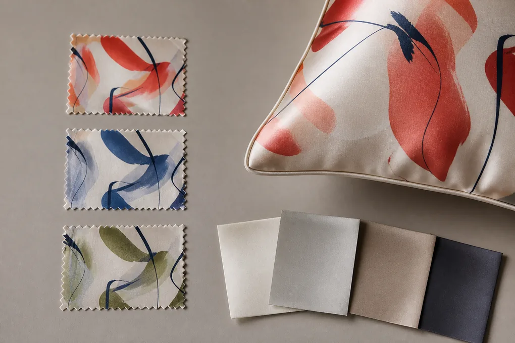
Keep Care, Material, and Retail Claims Specific to the Reviewed SKU
Retail copy often becomes the weak point of an otherwise disciplined product program. A printed silk pillowcase may be described with broad care, comfort, beauty, or performance language that has never been reviewed against the exact assembled product. We keep the content useful by separating visible product facts, buyer-approved claims, care instructions supported for the configuration, and language that still needs evidence. This protects the purchaser who must pass information through a retailer, marketplace, legal reviewer, or internal product-data system. It also reduces a costly cleanup cycle in which a marketplace listing, package insert, and buying specification all need correction because one unverified phrase was copied from a general silk category page.
Write Product Facts That Match the Approved Configuration
Describe the printed face, artwork treatment, opening, edge, label, and pack only as they apply to the named SKU
Prevent a feature from being copied across variants that do not share it
We recommend beginning with facts a customer or buyer can observe on the approved product: the pillowcase style, printed artwork direction, visible opening type, selected edge detail, intended pack format, and any included component. Keep the statement attached to the named variant. If another SKU uses a different artwork field, reverse panel, label, or pack, give it its own description rather than reusing a broad paragraph. This supports product-data accuracy and reduces the chance that an online listing promises a feature not present in the received unit. We avoid generic statements about luxury, wellness, hair, skin, sleep, or long-term performance unless the buyer has independently approved the exact claim and its support. The product page should help a procurement professional identify what is being bought, not replace evidence with persuasive adjectives.
Develop Care Wording From the Actual Assembled Product Review
Do not borrow universal textile instructions for a printed item with its own construction and components
Keep customer guidance aligned with the product that was examined
Care wording belongs after the buyer has identified the complete configuration and the product point it needs to review. A printed pillowcase can include details that make a generic instruction incomplete or misleading, such as a particular opening style, edge construction, attached label, or mixed component. We do not publish a promised care outcome simply because it is common in the market. Instead, identify the proposed consumer guidance, the destination context, and the buyer-side confirmation needed before that guidance is released. If a retailer has mandated wording, attach it to the SKU and note whether it applies to the pack, sewn label, or digital listing. This approach gives your team a practical route to finalize copy without pretending that one standard phrase covers every design and construction decision.
Route Regulated, Certified, or Performance Language Through a Separate Check
Hold certificates, testing references, and benefit claims outside the product description until they are verified for scope
Avoid a commercial statement that cannot be supported for the specific item
A buyer may need certification information, testing information, or approved benefit language for a retailer or marketplace. Those requests deserve a separate, product-specific review. We do not imply certification, colorfastness, health benefit, or performance because an artwork file or a general catalog reference exists. Record what document or test is needed, which product configuration it must cover, and who is responsible for approval. If the evidence is not available, keep the consumer-facing claim out of the copy and continue with the factual product description. This is a safer commercial approach for a B2B program because it allows marketing and procurement to move at an honest pace. It also reduces the risk that an unverified statement is duplicated across a product family and becomes difficult to correct after a retail listing is live.
Design Label and Pack Presentation Around the Printed Product
Packaging is not an afterthought for an artwork-led pillowcase. The selling unit determines which part of the print a buyer or consumer sees first, whether the surface is protected from scuffing or pressure, how variants are identified, and whether the label, insert, barcode, and compliance material remain connected to the right SKU. We help your team plan the product and pack together so the printed face is presented intentionally rather than hidden by a last-minute fold or generic insert card. A pack review also lets the buyer verify that a store associate, warehouse team, or online fulfilment process can identify the intended variant without relying on a loose verbal description.
Choose a Fold That Presents the Intended Artwork Without Overstating the Product
Define the visible face, fold sequence, protective layer, and any insert relationship for the selling unit
Make the first customer view match the range direction your buyer approved
A fold should support the product story you have already approved. Decide whether the retailer should see a centered motif, a coordinated repeat, a border detail, or a clear color field before the item is opened. Then identify the fold sequence that makes that view repeatable. If tissue, a sleeve, a pouch, or an insert is proposed, explain its role: surface protection, information delivery, product containment, or presentation. Do not assume that a pack photo represents the final method unless the brief says so. A printed pillowcase can look very different when folded tightly, placed behind a window, or wrapped around a card. We use a physical pack review to make those effects visible. This lets your merchandising team approve the selling-unit impression while purchasing can identify which pack components need their own artwork or data fields.
Connect Labels, Barcodes, and Inserts to the Correct Variant
Use the commercial variant identity consistently across product, pack, and product-data records
Avoid colorway mix-ups that emerge only after a carton reaches a distribution team
Every pack component should point back to the same variant identity used in the artwork and product matrix. That includes the size or configuration name, colorway name, internal product reference where applicable, barcode assignment, and any retailer-required information. We recommend reviewing the pack proof beside the finished pillowcase rather than as a separate graphic exercise. This exposes a common problem: a pack may look correct in isolation yet refer to an outdated artwork revision or a similar-looking colorway. Where several variants share one pack structure, identify which fields change and which remain common. Your operations team then has a simple way to check completeness. We do not invent legal or compliance copy; buyer-supplied requirements and approved wording should be treated as controlled inputs with their own revision status.
Inspect the Packed Unit for Presentation Damage and Information Errors
Review the real product after folding, packing, handling, and reopening rather than approving a flat dieline alone
Catch creases, transfer, missing parts, and misleading identification before the pack is released
A complete pack review looks beyond appearance. Open the selling unit as a customer or retail associate would, check the printed surface for pressure marks or transfer, confirm that the intended motif is visible, and verify that the product can be returned to the pack without confusion. Then compare the label, insert, barcode, and any protective component with the named SKU. Note the observation and the reference used for approval. If the pack introduces a crease across a signature illustration or hides the distinguishing feature of a colorway, revise the fold or presentation instead of accepting the issue as cosmetic. For a B2B buyer, this is where product development and supply-chain concerns meet: the pack must communicate the item accurately while protecting the presentation that supports the planned retail channel.
Inspect Bulk Units Against the Approved Artwork and Product Record
Bulk inspection is most effective when the team checks the decisions that make this printed pillowcase distinct rather than relying only on a generic textile checklist. We help buyers build a review list around the approved artwork revision, print direction, placement, panel relationship, opening, edge, variant identity, label, and packed presentation. The list should identify what is visible, which reference controls the comparison, and how a finding is recorded. It should not manufacture undisclosed limits after goods are ready for review. A buyer gains a more useful report when the review connects the observation to a named product feature, not merely to a broad category such as appearance or workmanship.
Prioritize the Artwork and Construction Features That Define This SKU
Inspect the named visual and assembly points that differentiate this product from a solid-color pillowcase
Focus quality attention on the details a buyer and retailer will actually notice
For a printed pillowcase, begin with the approved artwork identity and the way it sits on the finished item. Check orientation, obvious placement concerns, key motif visibility, panel consistency, opening relationship, edge appearance, and the visual separation of named variants. Add the product details that your brief identifies as commercial priorities, such as a border, a directional print, a presentation fold, or a specific label location. Use photographs, approved sample views, and the current product record as comparison references where available. We do not tell a buyer that every item must meet a universal visual standard; the relevant review points come from the product route you have selected. This makes findings easier to interpret because the inspector can state what was observed and why it matters to this SKU.
Sample Across Meaningful Variants, Lots, and Pack Configurations
Make sure the review is not limited to one attractive unit or one product presentation
Find variation that a single sample cannot reveal
Where the program includes multiple colorways, sizes, or packed configurations, plan the inspection coverage so each meaningful difference is represented. A report should identify the units reviewed by variant or lot context rather than implying that one good-looking item represents the whole program. Examine both the pillowcase and its selling unit when packaging is part of the approved product. If a finding appears, record the location, the item identity, the quantity or frequency observed where known, and the approved reference used for comparison. This is more useful to a sourcing manager than a vague statement that quality was checked. It allows the buyer to distinguish a presentation issue, an artwork-placement issue, a construction issue, or a data-identification issue. The resulting conversation can then focus on a remedy or next review step instead of arguing about an undefined standard.
Close Findings With a Product-Specific Decision and Traceable Next Step
Describe the correction, containment question, or additional review in terms of the exact affected configuration
Turn inspection evidence into a usable purchasing decision instead of a generic quality report
When a review identifies a concern, we encourage a direct product-specific response. State whether the issue affects a named artwork revision, a certain panel position, a colorway, an opening arrangement, or a pack component. Then identify the decision needed: compare against the approved sample, review another unit, clarify the product record, revise a future artwork file, or hold a particular configuration for buyer direction. Avoid a blanket conclusion that hides the scope of the finding. A B2B buyer needs enough detail to decide what can proceed and what requires attention. This final record also supports the next product cycle because it shows which design choices created unnecessary risk and which approval references were effective. It is a practical close to an artwork-led pillowcase program, not a promise about unverified outcomes.
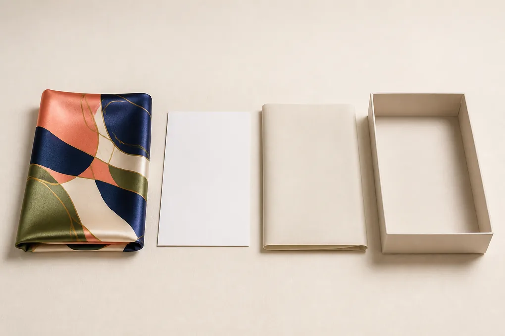
Printed Silk Pillowcase Artwork Questions for Procurement Teams
What belongs in a printed silk pillowcase brief?
Include the authorized artwork version, intended repeat or placement, proposed finished size, panel and opening concept, edge treatment, color references, label and pack artwork, quantity by SKU, destination, and the exact decision the sample must answer.
Why is a flat artwork proof not enough?
A flat proof cannot reveal how scale, cutting, seam allowance, closure position, filled-pillow shape, retail folding, and light affect the motif. Review artwork on a sewn, finished configuration before treating it as a product approval.
Can one printed sample approve every colorway and size?
No. A different colorway, size, artwork placement, construction, or pack may introduce a separate decision. Link each sample conclusion to the exact SKU or variant it represents.